Savar
A natural, gentle skincare brand enriched with New Zealand ingredients, formulated for high efficacy, dermatologically approved for sensitive skin. Rebranded the packaging system for new and existing ranges.
Responsibilities:
Packaging, rebranding, art direction, icon design, photo editing
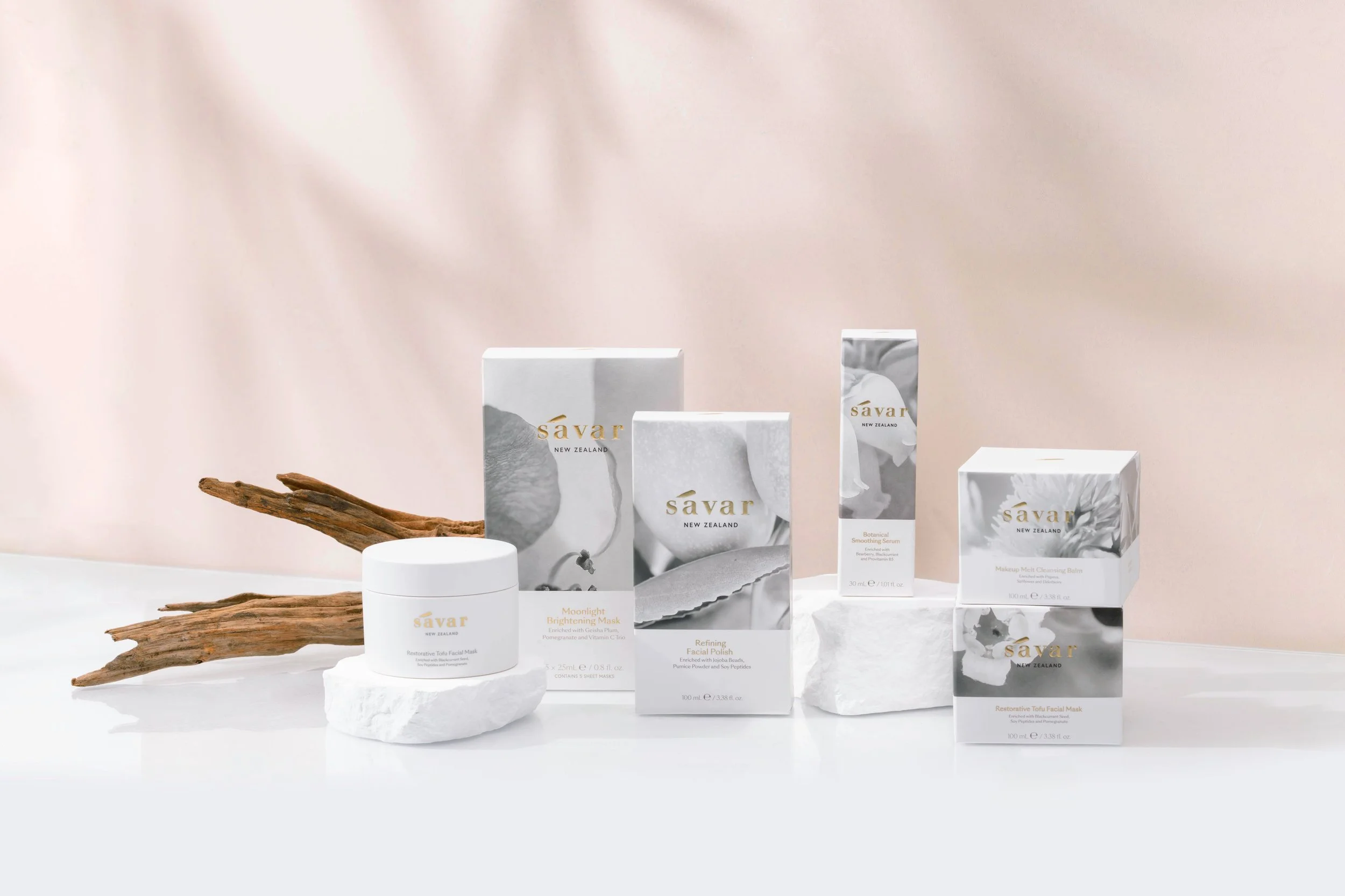
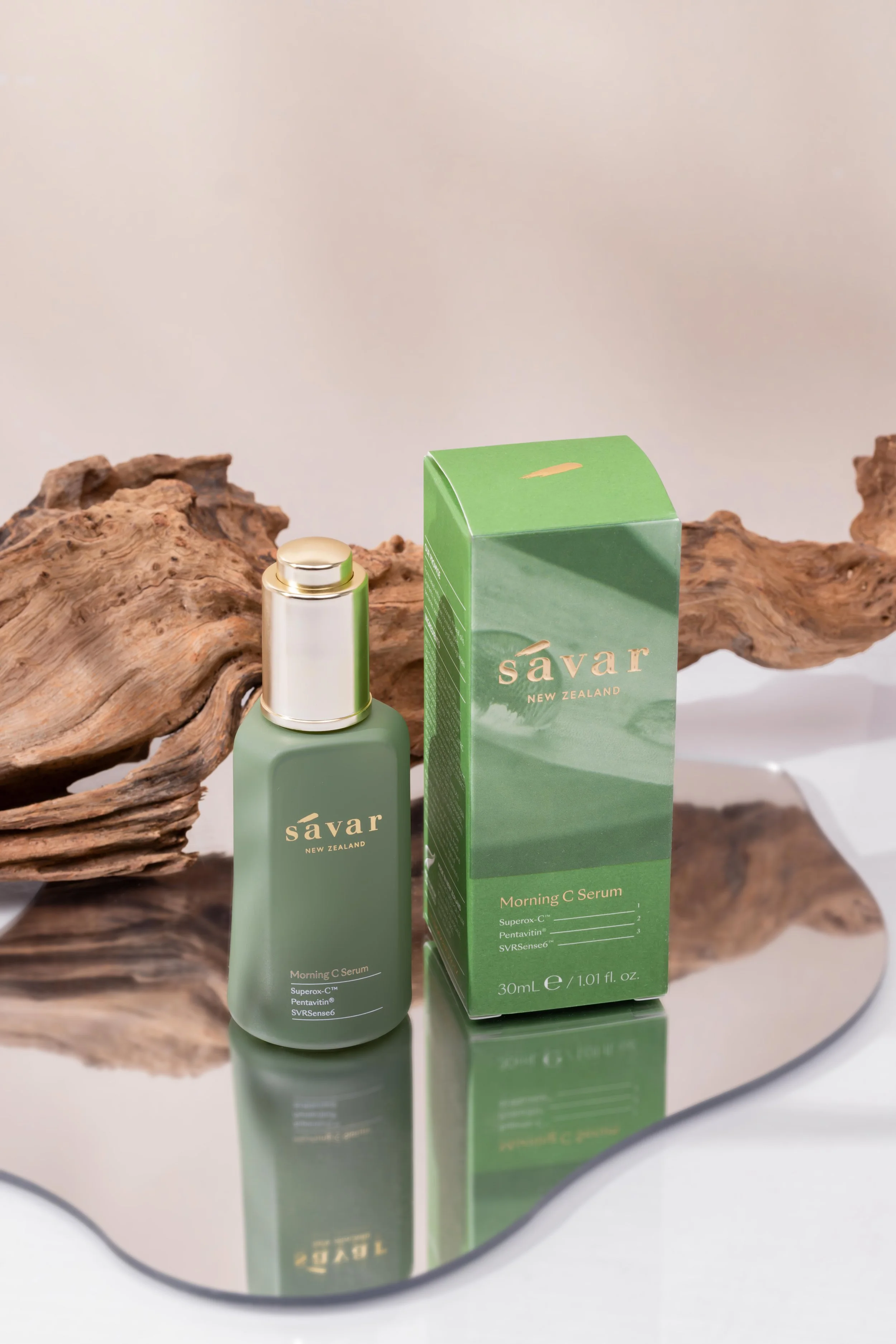
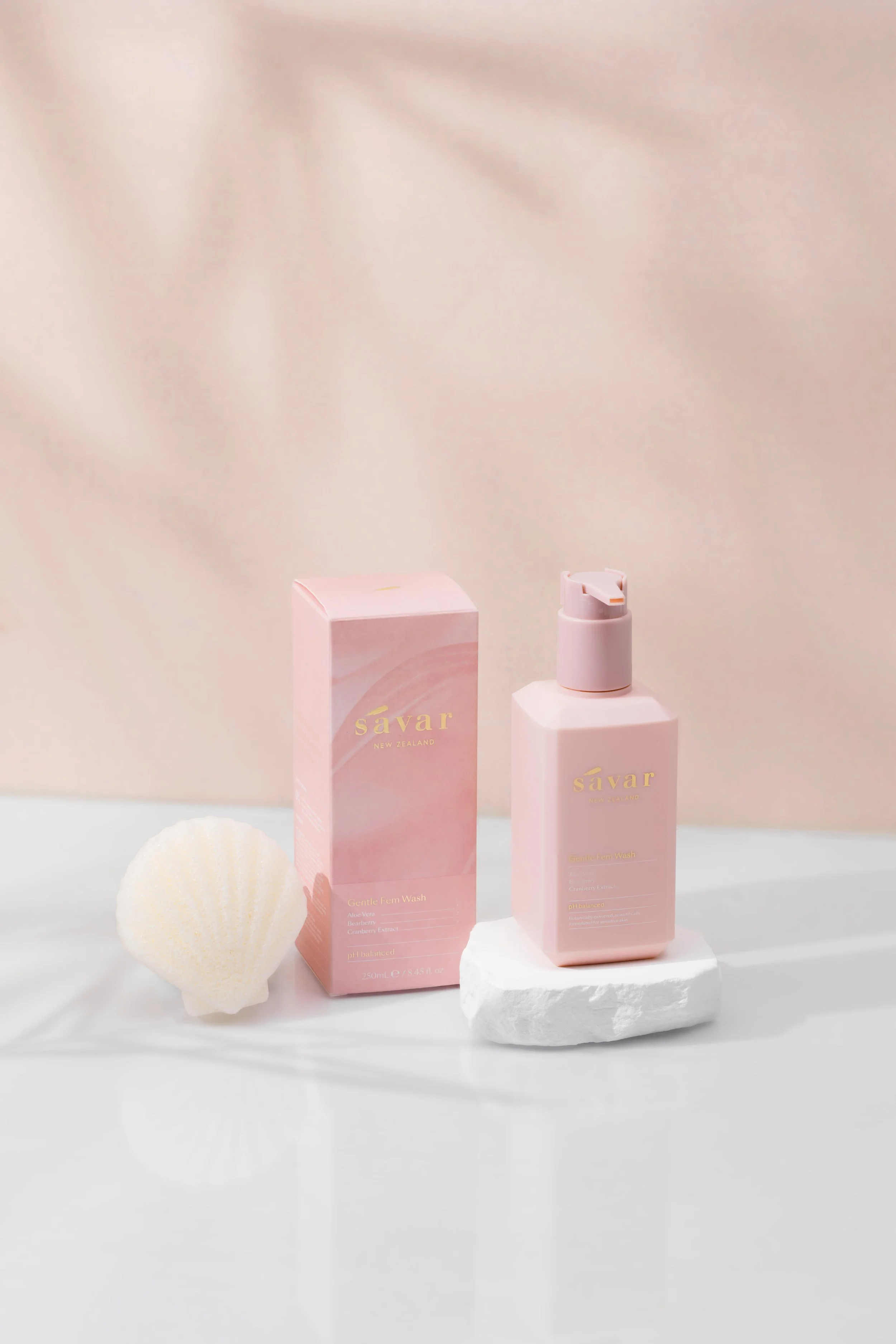
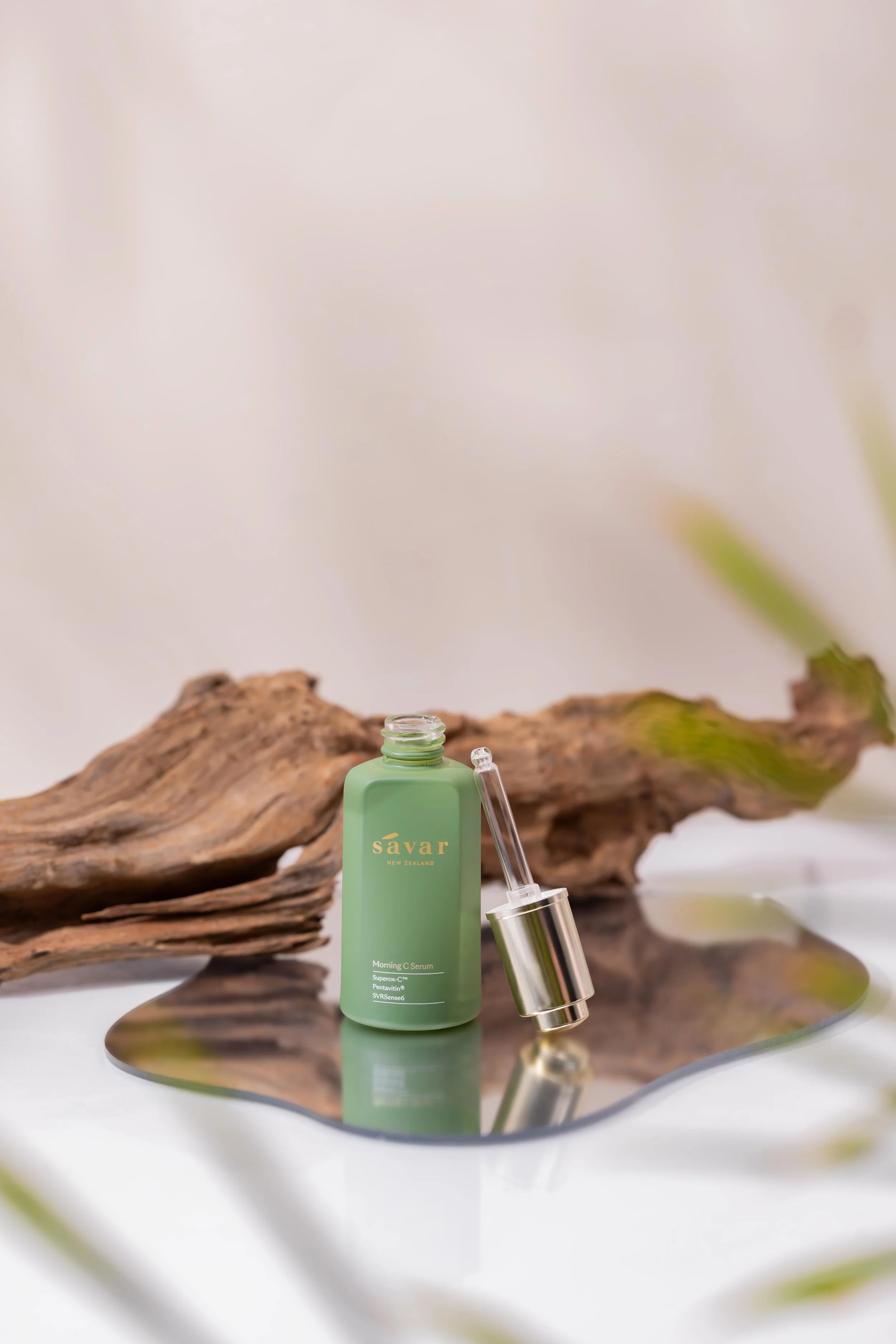
Embracing the beauty of nature
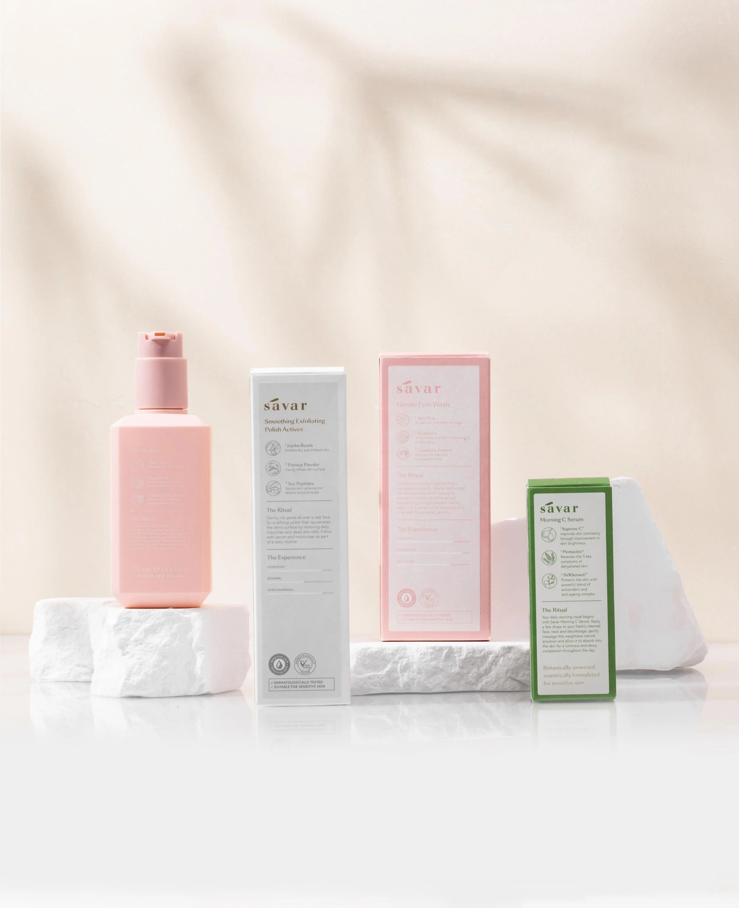
Savar's new packaging design draws inspiration from the core ingredients, creating a multi-sensory experience for their customers, as well as it’s innovative science-based formulation.
The new packaging aesthetic embraces Savar’s appreciation of the New Zealand flora landscape. It’s delicate, clean and feminine with a visual emphasis on the hero ingredient and decorated with delicate gold foil to highlight the brand logo, product name and the Savar slogan.
A system was introduced to effectively display the product education at the back of the secondary packaging, bespoke custom icons symbolising active ingredients, and the strength level of each benefit. The language and tone used across the subheadings are more ritual-based, drawing from intentional skincare routines.
Collaborators:
Daphne S (Design), Millie J (Photography)