iO Energy Dashboard
Enhance internal staff productivity and elevate customer service by refining workflow efficiency. Optimise dashboard utility, minimise user flow friction, and implement visually cohesive dashboard aesthetics to create a seamless and delightful experience.
Deliverables:
Hi-fi prototype, style guide, design system and grid
Responsibilities:
User interface design, user experience design, prototype, user testing, iterations, design system, branding
Big mission, complicated tools
About iO Energy
iO Energy is an Adelaide-based, visionary energy company with a compelling mission to drive Australia's transition to Zero Carbon. Their goal is to empower everyday individuals to maximise their use of affordable, clean electricity, fostering a smarter and more sustainable approach. By enabling Australians to pay less for clean energy, iO Energy is at the forefront of advancing a greener and economically viable energy landscape.
The Problem Statement
iO Energy staff find the existing structure of the PowerBI report overwhelming to use. The functionality of the current design has no proactive flagging capabilities, complex navigation, and low visibility over tasks and customer insights.
This can result in a poor customer experience, employee dissatisfaction and inefficiencies in business processes.
Designed for efficiency and simplicity
Implemented purposeful functions to address user pain points, enhancing the overall user experience for existing and new staff.
The Task
Design and implement a platform with an intuitive, friendly, and organised interface, optimising the user flow for internal staff to effortlessly view, track, and filter account information and data.
The Outcome
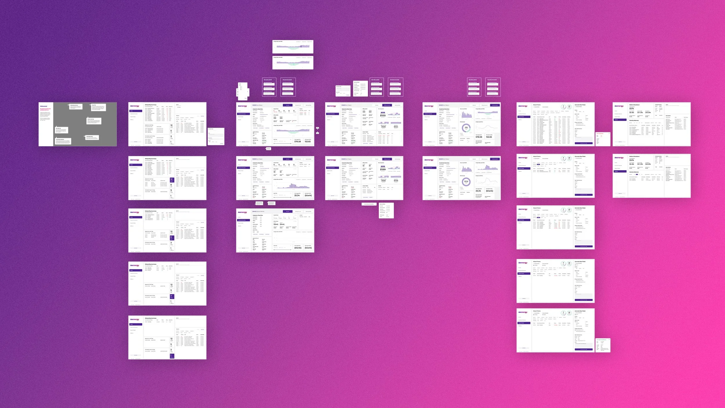
We created a hi-fi prototype that addressed pain points and aligned with the internal team's needs, enhancing their workflow. Our solution achieved:
* Enhanced forecasting and tracking of internal metrics, customer details, and issues by improving content visibility.
* Streamlined daily tasks through easy information filtering on internal dashboards, reducing friction for users.
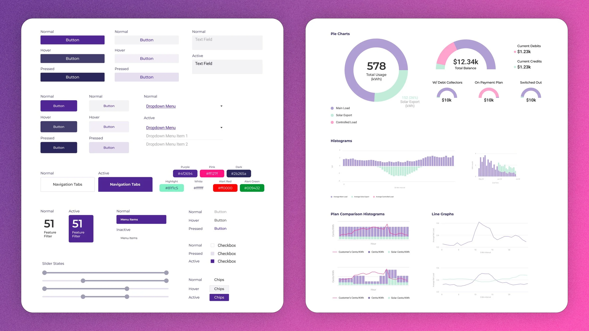
* Improved dashboard viewing experience by implementing an effective design system, defining visual language, and enhancing page hierarchy.
* Introduced an intuitive user flow with clear labelling and improved data organisation for seamless navigation.
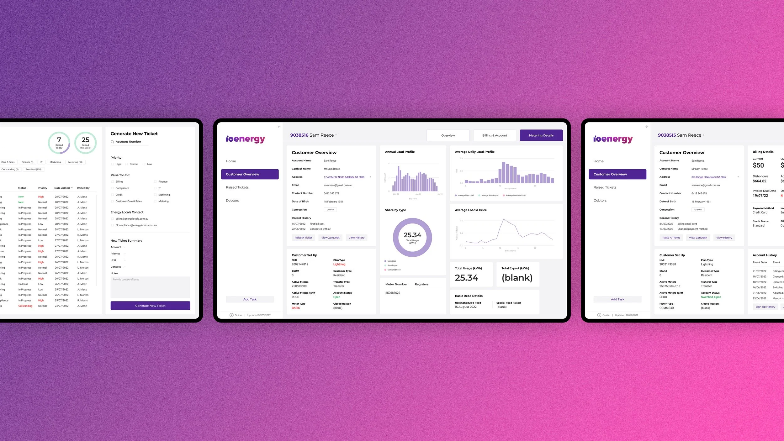
1. Address Dropdown Menu
Simplified search with a dropdown menu for different addresses.
Enables seamless data retrieval for chosen locations without restarting searches on the main dashboard.
2. Tabbed Customer Information
Quick access to customer overview, billing, account, and metering details.
Organised layout for easy viewing in respective categories.
3. Note Functions
Effortless addition of tasks or notes for inquiries or issue calls.
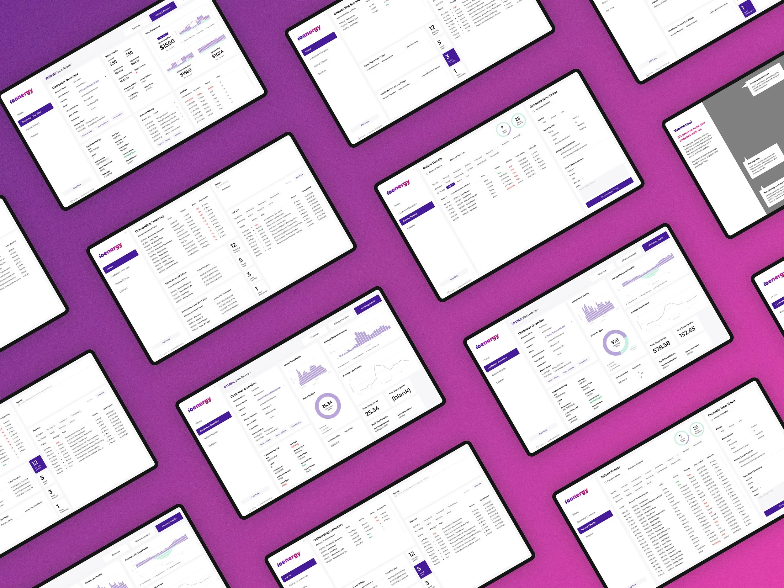
4. Easy-to-Access Onboarding & Instructional Information
Onboarding and instructional information overlays on dashboard pages for all staff.
Provides clear instructions on using the dashboard and highlights each section's purpose.
5. Filtering Options for Faster Information Retrieval
Lists with filters and numeric indicators for quick keyword-based results.
Facilitates swift access to customer details.
6. Colour-coded Data
Universally understood colour indicators for alert levels and action outcomes. Implemented to speed up identification of critical matters or slow-moving tickets.
7. Integrated Ticketing Functions
Merged raised tickets list with a streamlined new ticket generation feature.
Simple checkbox system accelerates ticket processing for the busy team.
8. Adapted Branding to Elevate Dashboard Experience
Integrating iO Energy's visual branding into the dashboard to enhance the simplicity and coherence of the staff's user experience.
Reflections & Lessons Learnt
iO Energy team positively responded to our upgraded dashboard design, praising the integrated visual branding, streamlined design and user flow, and the new features that enhance usability and user experience of PowerBI. They believe the new dashboard and implemented features will help to relieve their current extensive work flow, enhancing crucial customer service and maintaining positive customer relations.
They appreciated the team’s decision to implement the new design into their existing workflow despite suggesting blue sky thinking to explore all possibilities for a design solution. I discovered it was important to reading between the lines of what clients say and keep communication open, order to discover the best solution to solve their issues. Clients know what they want but can be stuck in the solution they’ve come up with in their mind. This is where listening, research and expertise comes into play to create the best solution that addresses pin points and issues.
iO Energy plans to kick-start workflow improvements with the design implementation. The visually cohesive dashboard pages make it easy to implement further improvements by following our provided style guide and grid work. In order to truly experience the improvements, the time-constrained team will need a bit of adjustment to become familiar with the new dashboard design.
Credit to:
Nic F, Mos S, Kathryn L, Andy L, Charis L (UX/UI design), Rehan S, Thiru Y (Lead UX/UI)