Bean Body
Bean Body is a fun, personal care brand that aims to create enjoyment, transforming your shower time into a moment of excitement.
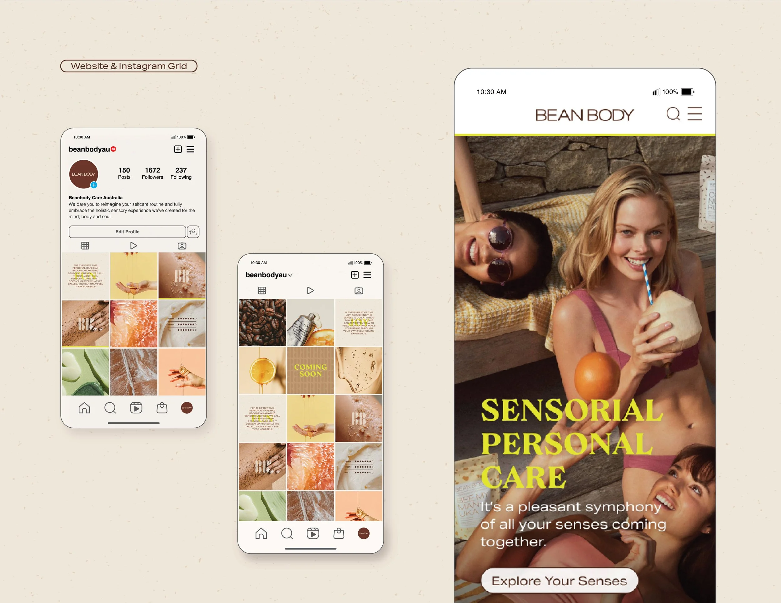
Designed a bold and ‘edible’ coffee-themed packaging concept to indulge the senses and promote play. Developed the packaging concept and visual identity addressing range extensions, digital and social media concepts.
Responsibilities:
Packaging, branding, visual identity, digital design, art direction
Indulge in the experience
Sustainability and packaging
Bean Body uses natural and organic ingredients that are cruelty-free, vegan-friendly and formulated without parabens.
With the world taking steps towards sustaining the earth, we saw the opportunity to bring Bean Body over the sustainability line. They were already in the game with their coffee ground body scrubs.
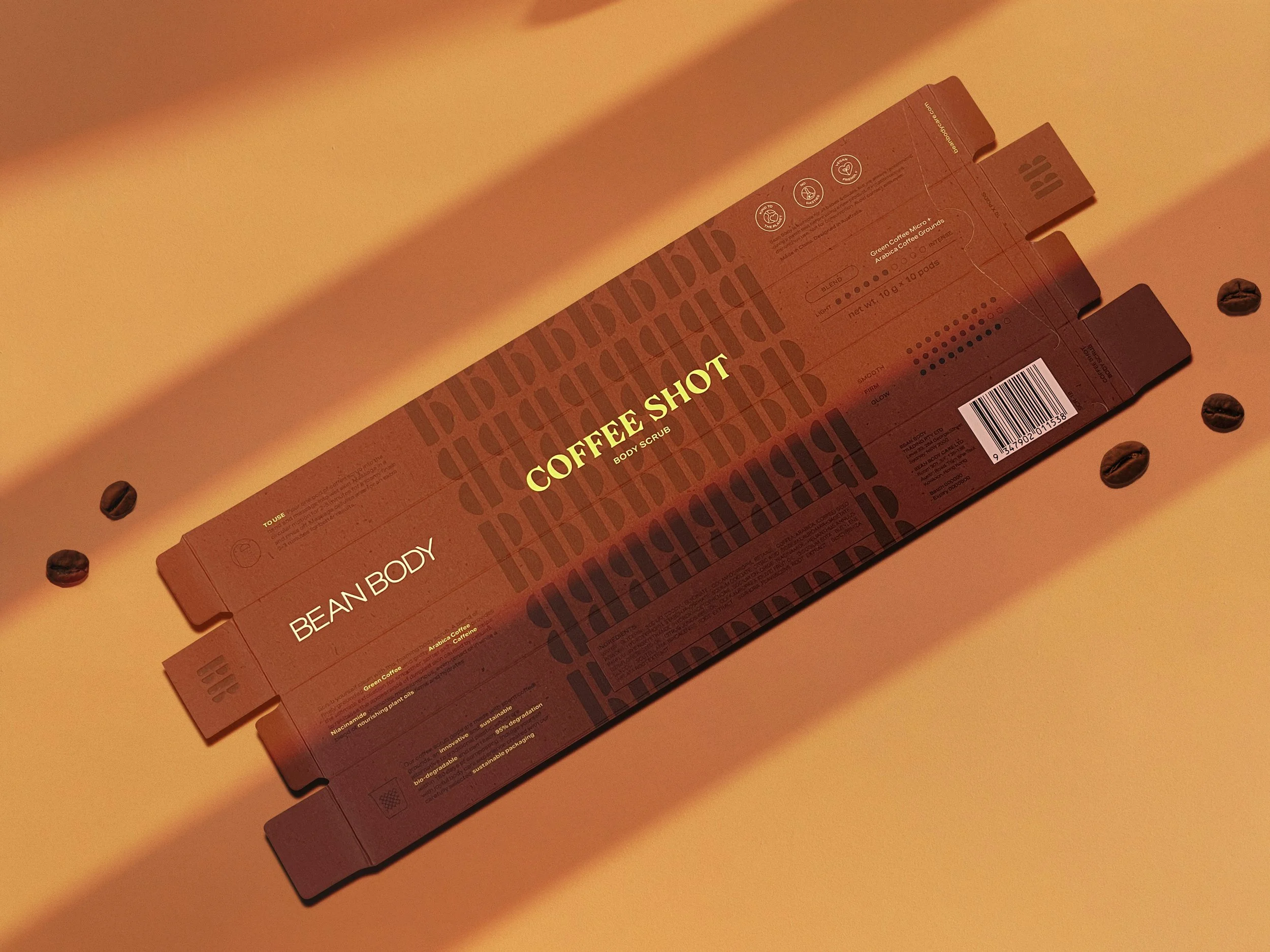
We introduced sustainability through their new product development packaging design by choosing materials that are sustainable, and having accompanying information speaking about how Bean Body considers the planet. We proposed using less plastics by innovative use of coffee ground as the scrub pods, recycled aluminium, and FSC approved paper for cartons.
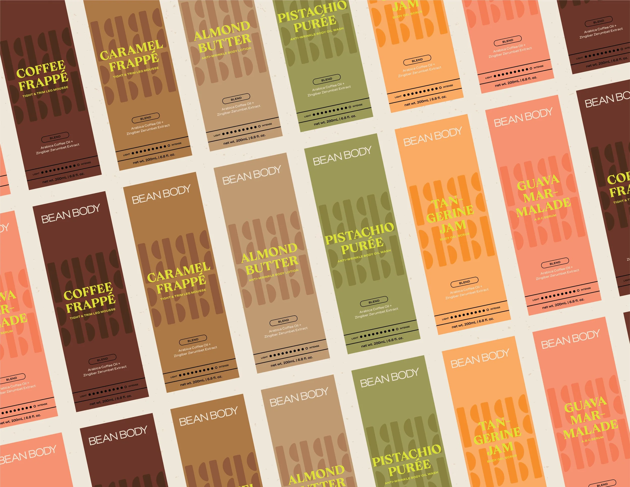
Make it edible
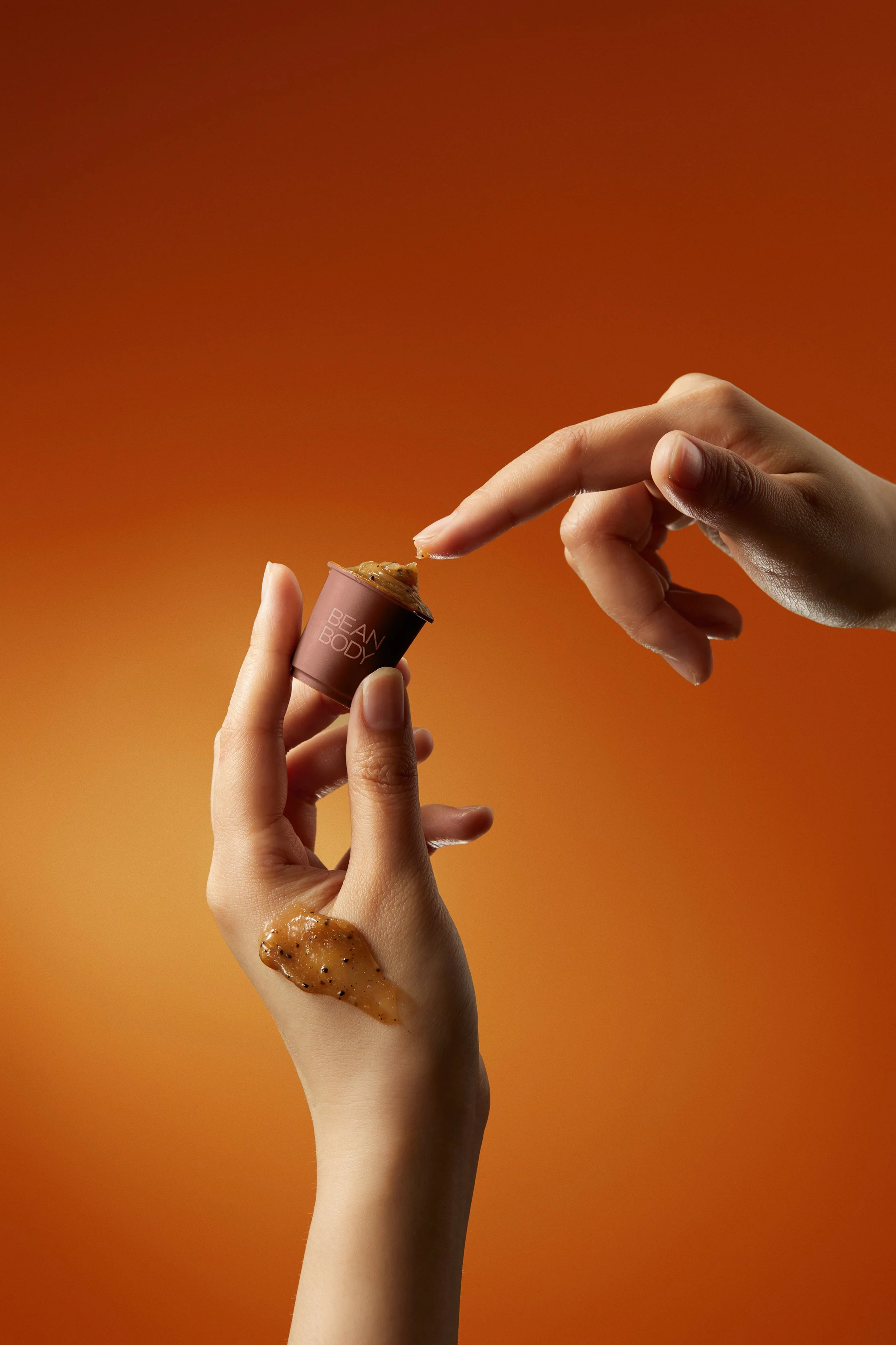
The goal was to bring a sense of play and enjoyment through texture, scent and sight - to turn a boring shower into an indulging experience.
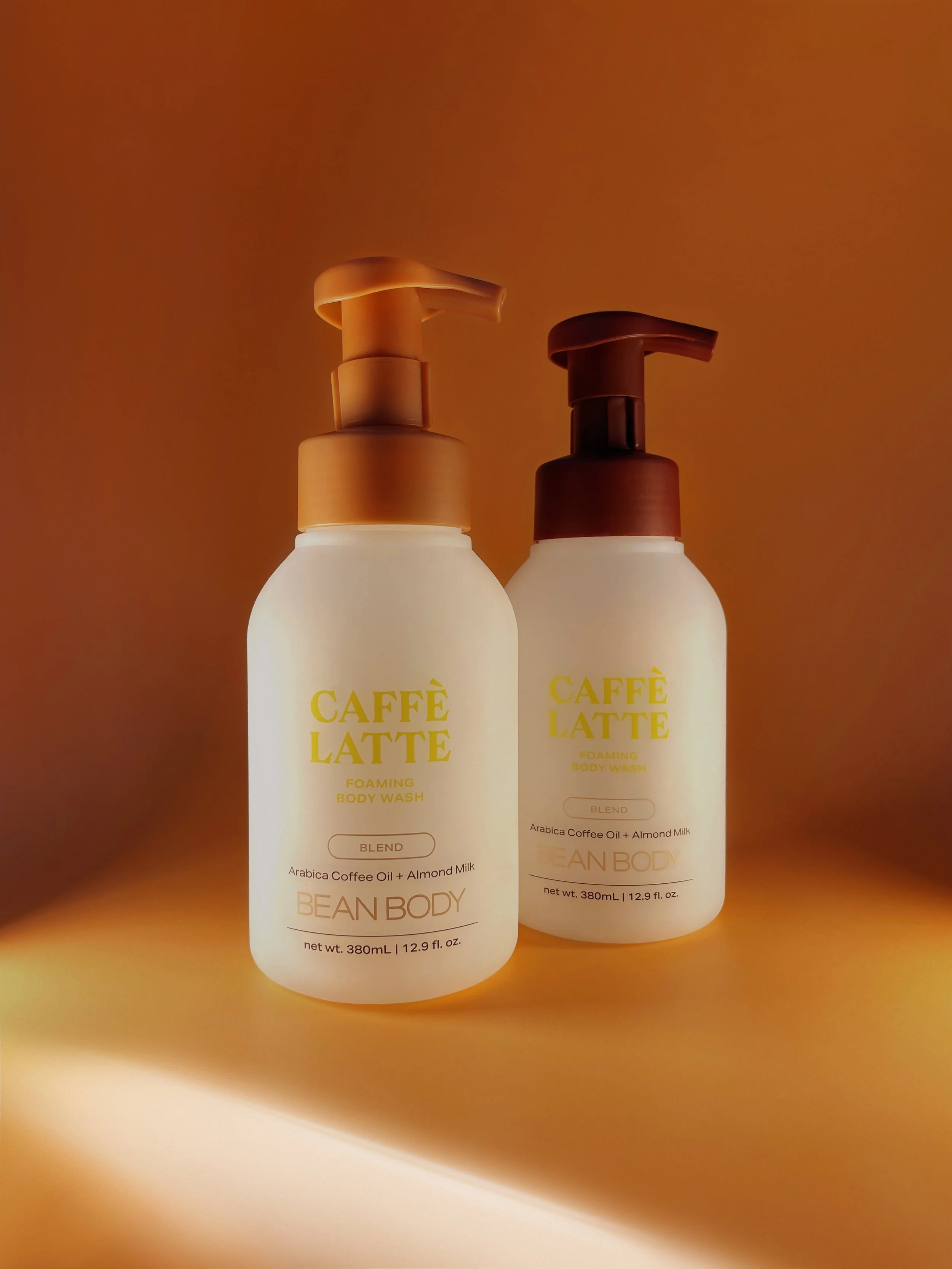
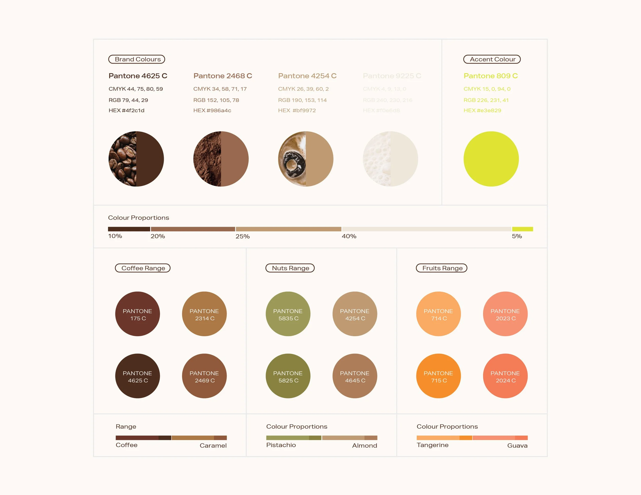
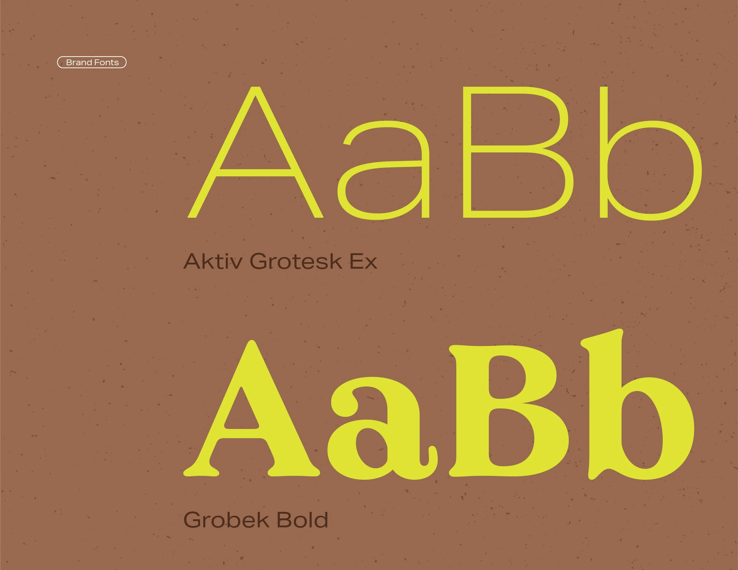
Inspired by coffee, we ideated ways to best illustrate a coffee-like experience for our customers. The packaging displayed shades of coffee colours for different SKUs, incorporated a graphic texture mimicking coffee grinds, an intensity-level graph to showcase the product benefits and a rustic BB pattern extended from their new icon mark. To emphasis fun, we introduced a bold neon yellow to highlight the product name and important information on the packaging.
We looked into extending the product ranges to cater for future SKUs, playing with vibrant tonal colours reflective of the ‘flavours’ and the summer-fun personality of Bean Body.
Credit to:
Daphne S (Designer), Cynthia L (Photography, edits)