Eimele Website
Enhance the eimele website's user experience and interface to boost sales, attract more customers, and effectively highlight the branding and packaging. Deliver an interactive prototype for mobile and web.
Responsibilities:
User interface design, user experience design, mid to hi-fi prototype for website and mobile, brand and packaging design, user testing, iterations, icon design
In with the new, out with the old
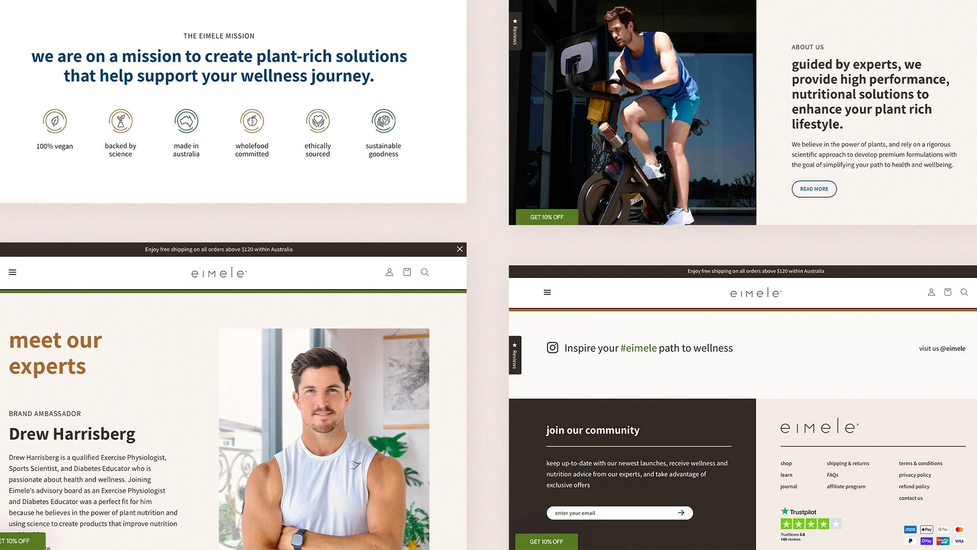
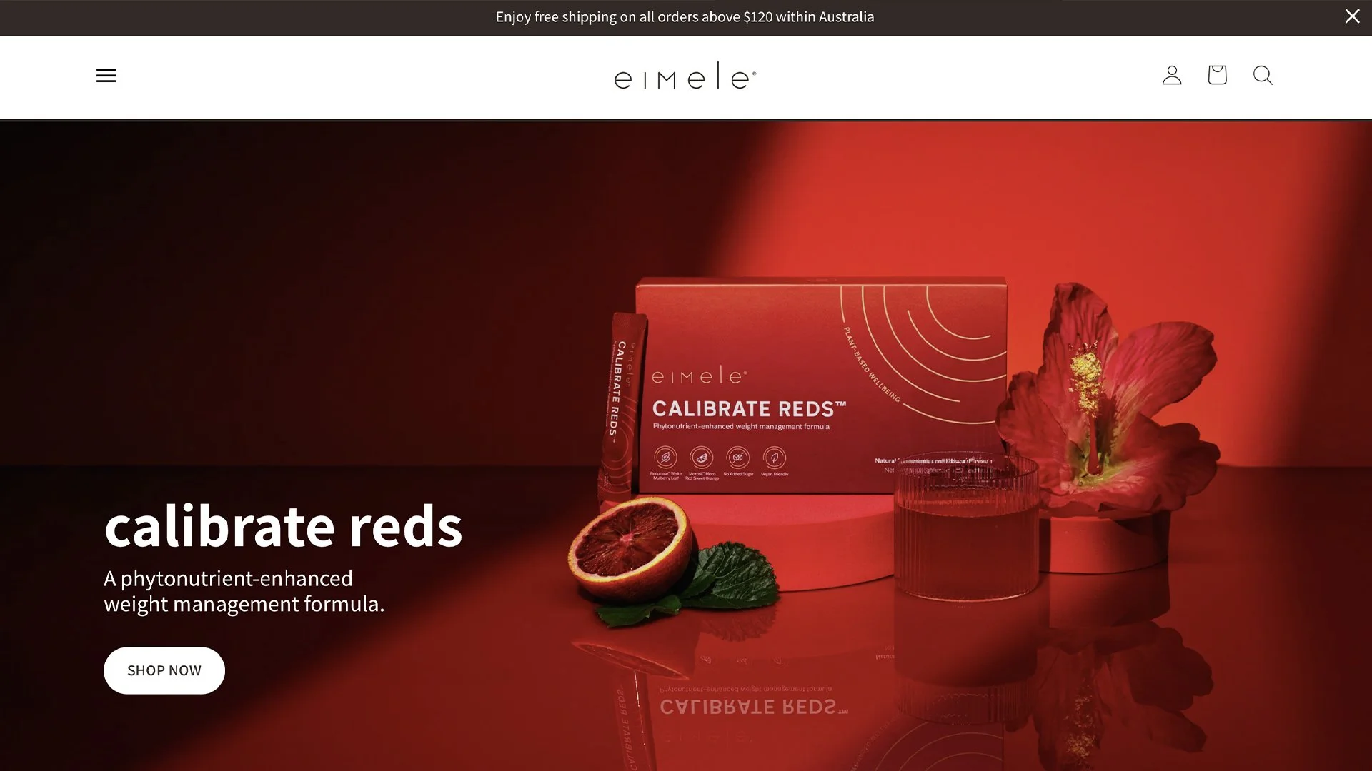
About eimele
eimele, an Australian vegan wellness brand, is undergoing a strategic transformation to establish itself as a go-to global wellness brand in the plant-based nutrition space. The pursuit of this new vision required a comprehensive revamp of packaging, branding, and digital presence.
Responding to the release of new packaging with the brand's refreshed identity, there was a pressing need to align the current website for coherency. This urgency stemmed from the upcoming introduction of their latest product, Shine Greens, and to accommodate an expanding product range scheduled for release in the coming months. As a brand that focuses on digital sales globally, it was crucial to initiate this redesign to attract increased online traffic, and to enhance user engagement, traction, and ultimately boosting sales.
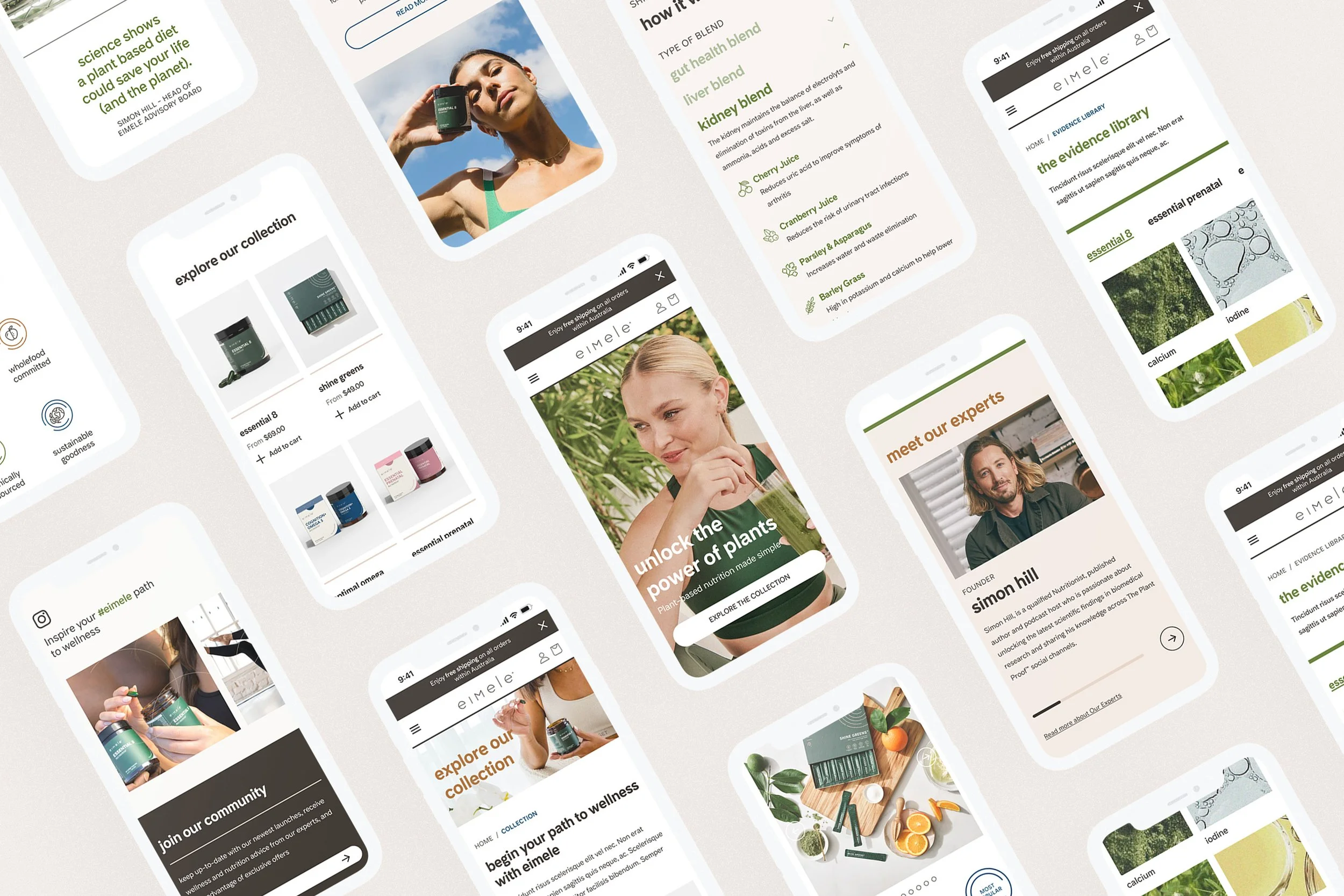
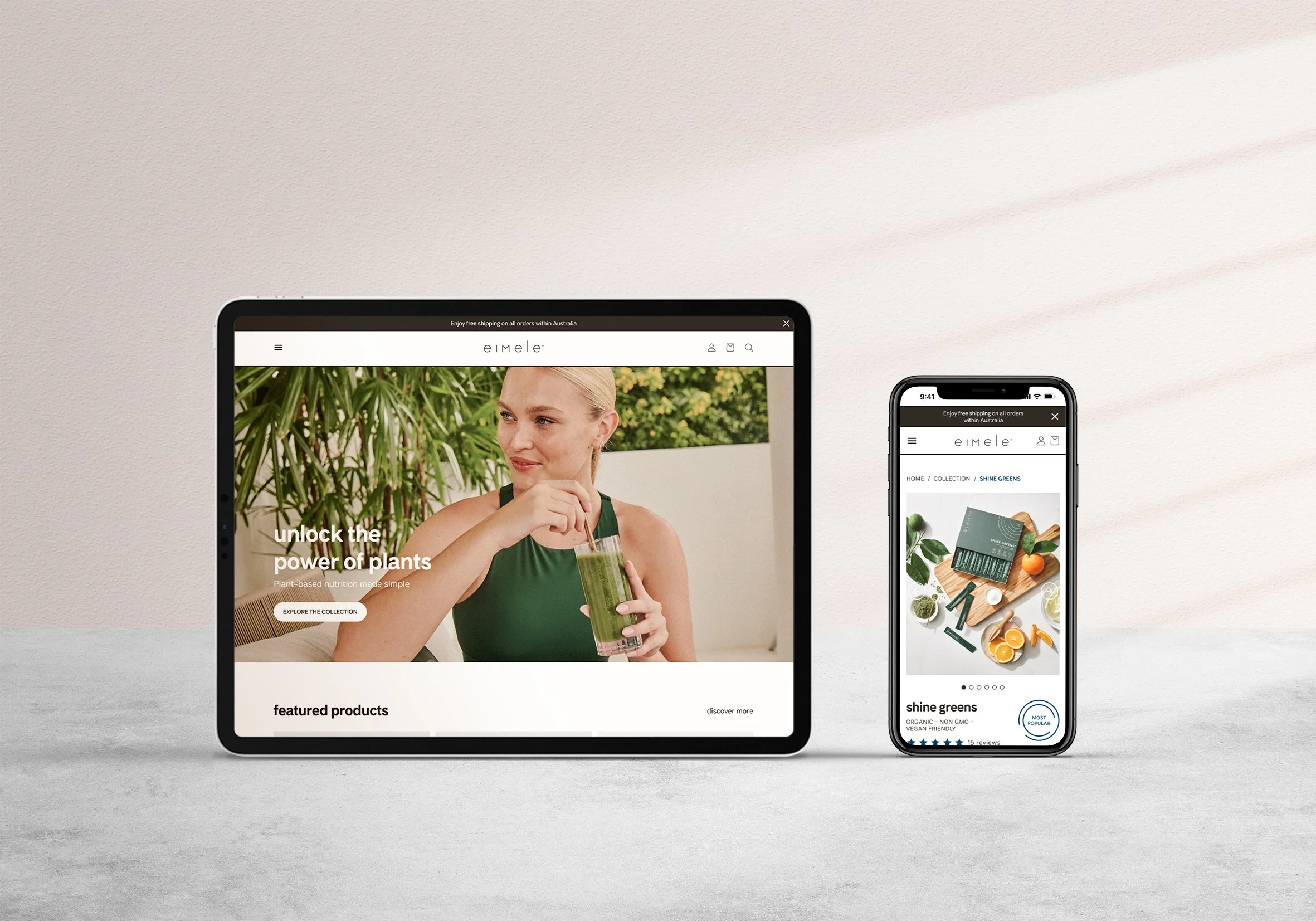
New mobile website
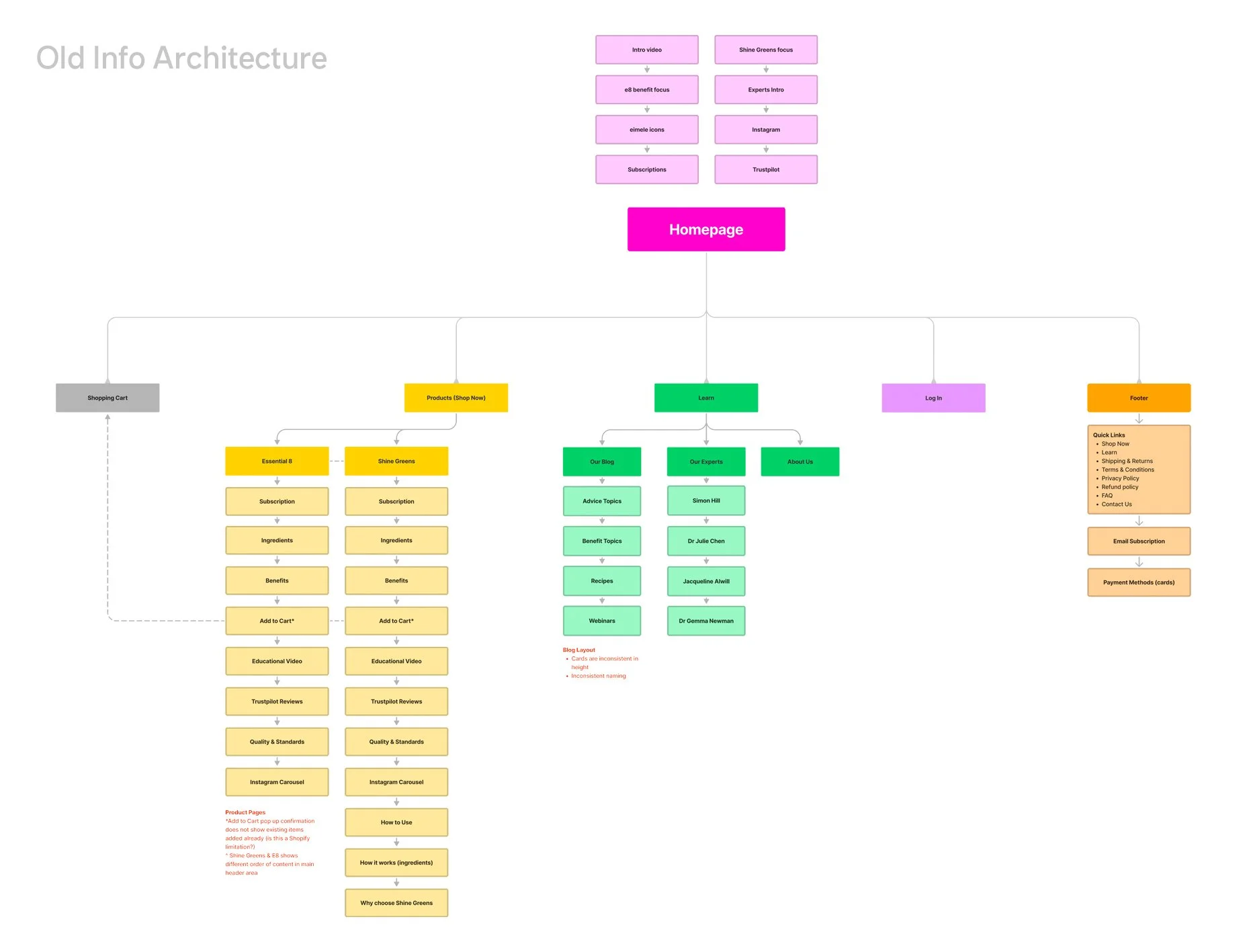
A discovery of the current state
Conducting a meticulous audit of each page on the existing website was crucial for comprehending opportunities to enhance the user experience. This involved analysing details, behaviours, and links to identify potential improvements, with the ultimate goal of creating a more cohesive and predictable journey for eimele customers.
Aligning this assessment with the new branding, I identified significant disconnections between pages, not only in terms of navigation glitches but also in the arrangement of information. To validate these observations and gain deeper insights, a contextual inquiry session was conducted, providing valuable input into the current state of the website.
Identified Pain Points:
Single-Product Focuse: The website exclusively showcased one product visually.
Essays instead of Lists: Users found FAQ and The Science pages overly long and dry, with an odd tick-box icon without clear purpose.
Ineffective Imagery Usage: Images overflowed, creating an unbalanced aesthetic. The interactive ingredient element was clunky and occupied unnecessary space.
Repetition of Copy: Marketing messages were ineffectively repetitive across the pages.
Illegible information: Text size and overlay on moving visuals made it challenging for users to access vital information. Lack of balance in font sizes between headings and paragraphs contributed to readability issues.
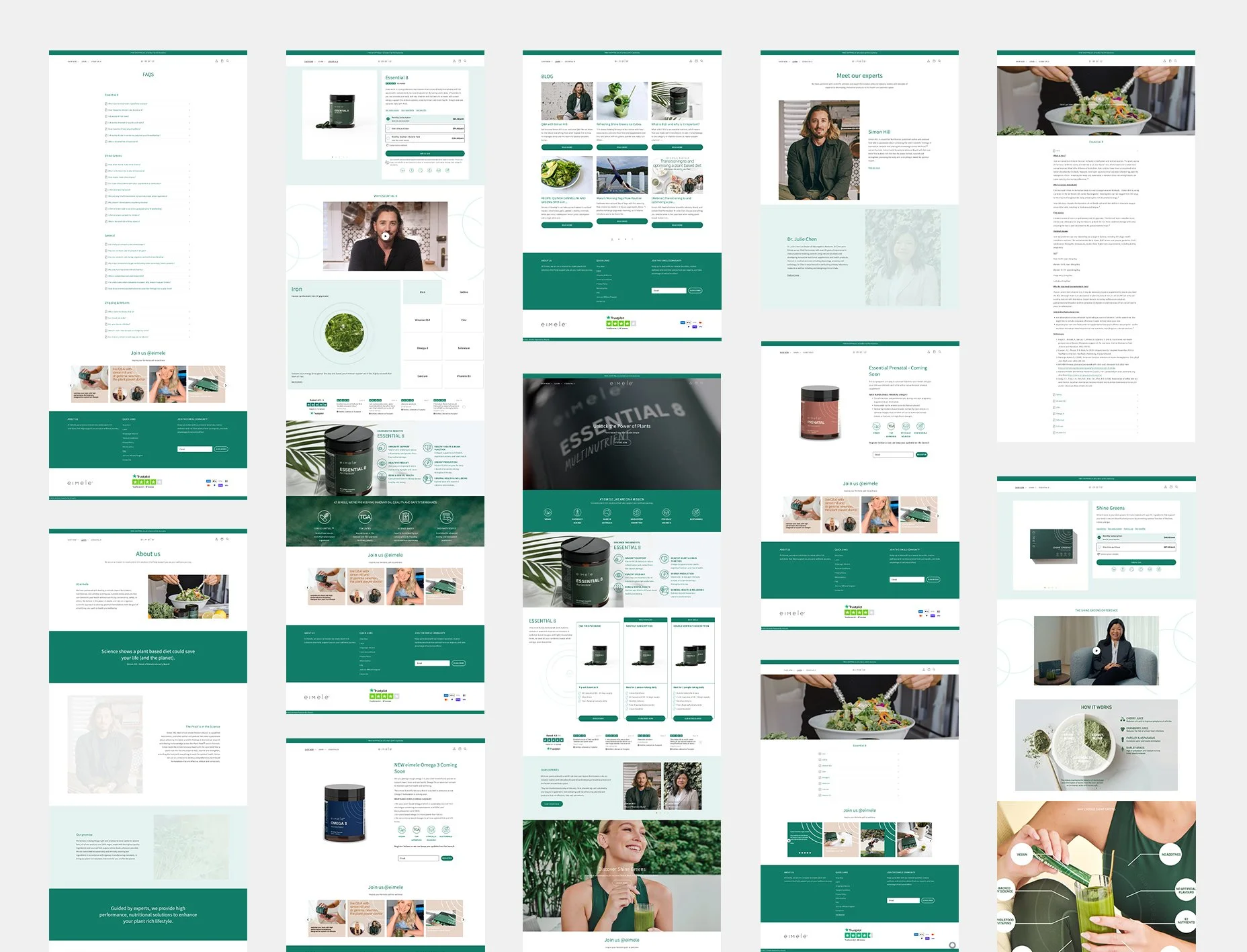
Old eimele website
Building for a better experience
Reframing observed pain points and customer feedback sparked ideas for enhancing the website experience.
Key questions guiding our design process included:
How might we create a visually cohesive digital experience and branding for customers?
How might we expand the website to accommodate future product launches seamlessly?
How might we declutter lengthy content to enhance readability for users?
How might we mirror eimele's 'ease-of-use' in the website's design, to extend the experience?
How might we inject an element of fun into the customer experience while educating customers about the products?
New desktop website
01 Improved Functionality
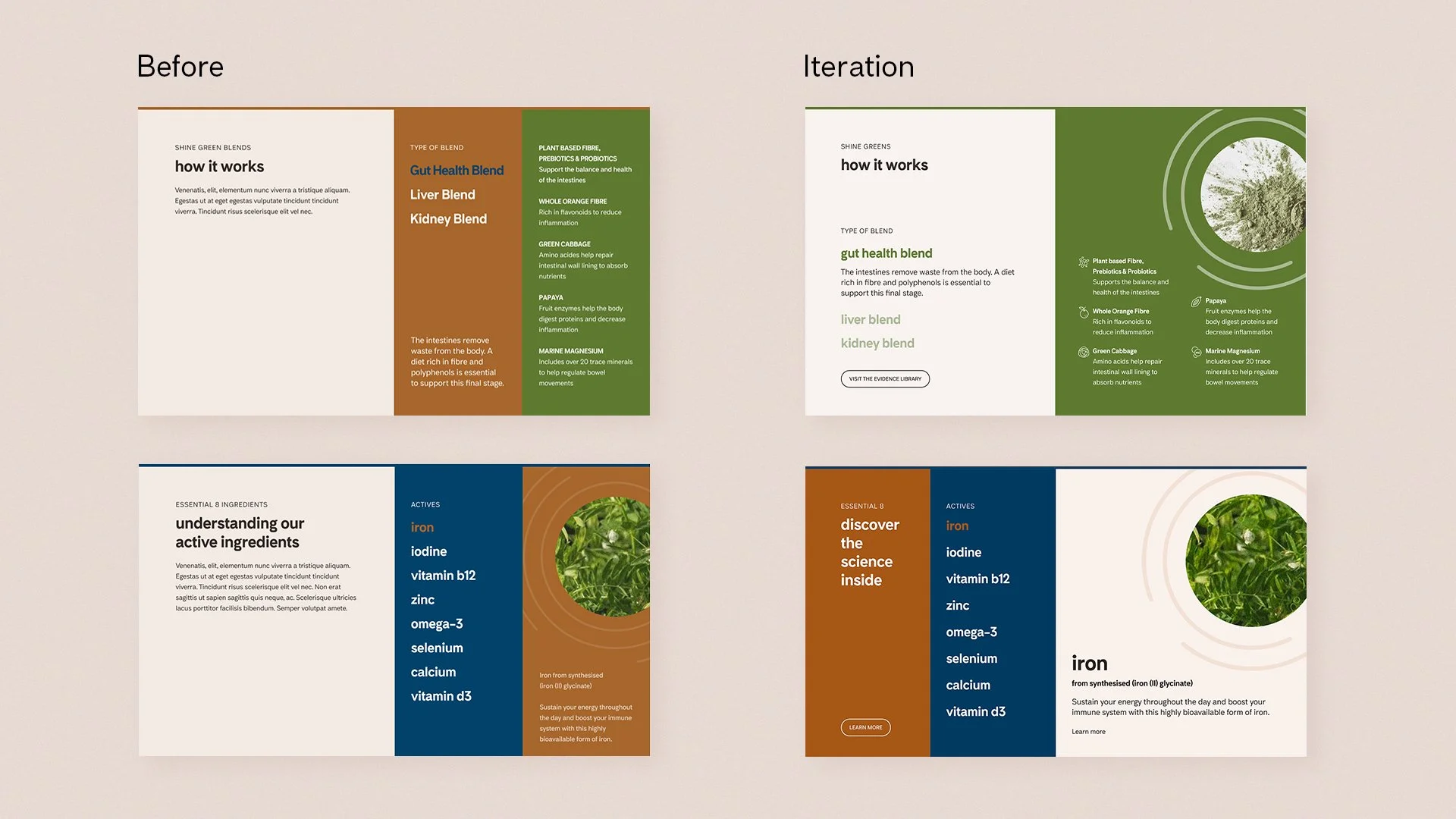
Through a thorough audit of the existing pages, I gained insights into customer navigation patterns on the website. By mapping out the information architecture, it became apparent that the original design focused on a single product, overlooking the potential for future expansions.
Digging into the copy and content, I identified areas for rearrangement and refinement, ensuring each page delivered optimised information without unnecessary repetition.
A conversation with the brand team highlighted critical elements essential for a successful solution. Their emphasis on educating customers with product information while guiding them toward purchase became a guiding principle for the redesign.
02. Enhanced Visuals
To create a more intuitive and engaging website experience, I studied well-executed designs from niche product sites and leading e-commerce platforms. Drawing inspiration from these, I brainstormed layouts and elements to incorporate into the new website for improved navigation and customer interaction.
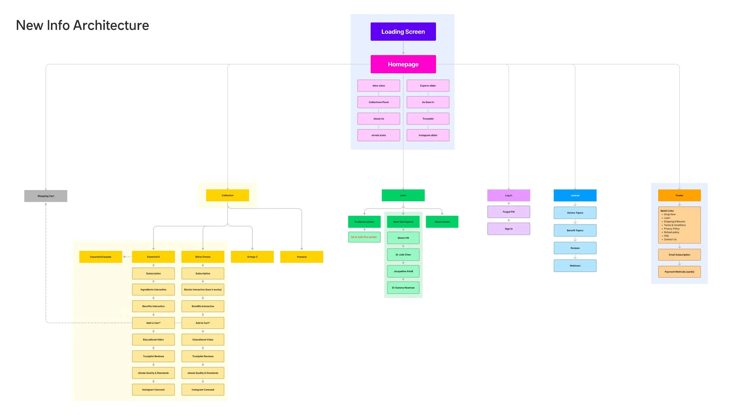
Leveraging a profound understanding of the new eimele branding, I crafted mid-fi wireframes for the essential pages, marking the commencement of the next phase. In aligning with the cohesive design language shared across packaging, branding, and digital platforms, the brand's essence was seamlessly interwoven into the consumer experience.
Key elements, such as the eimele dial, fonts, and colours, were thoughtfully integrated throughout the pages. To maintain a harmonious digital landscape, I meticulously considered factors like optimal font size for readability, precise text alignment, and a balanced distribution of white space, elements, and content, ensuring a clutter-free and engaging website experience.
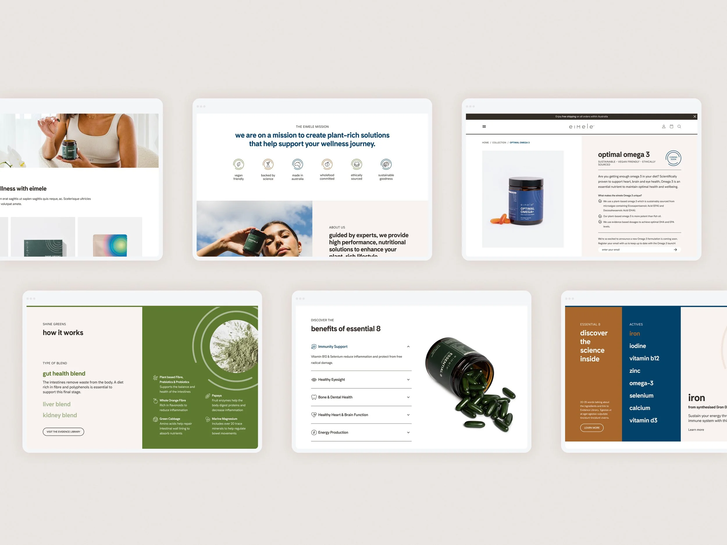
Interactive Learning Experience
eimele is dedicated to educating consumers about the exceptional benefits each product provides. Through interactive features showcasing listed benefits, active ingredients, and insights into product functionality, an engaging space has been designed for customers to playfully explore and enhance their understanding of their daily supplement intake.
Improving Clarity with Icons
Incorporating icons into the benefits feature enhances clarity, offering a visual representation of key topics. Icons serve as effective breaks in lengthy text, providing readers with visual relief.
This approach, along with the accordion element, proves particularly beneficial for mobile viewing. The website icons align seamlessly with the styling used in packaging, ensuring a cohesive visual identity across platforms.
Colour Harmony
We tested the balance brand colours with the imagery of each SKU. Given the vibrant nature of eimele products, achieving equilibrium among the primary brand colours (almond and charcoal) and the three secondary colours is crucial for crafting a well-designed page.
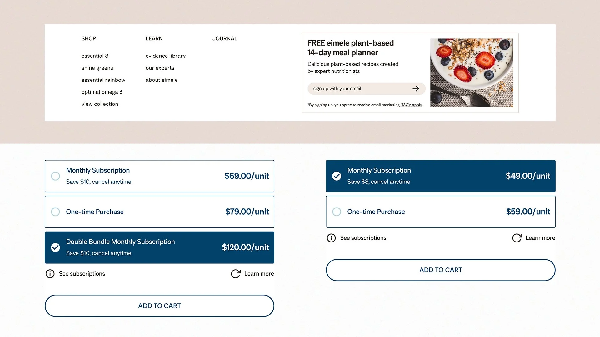
Thoughtful Sales and Subscriptions Strategy
In the initial user testing phase, feedback revealed that the subscription prompt on the main page felt too assertive early on. To address this, we redefined our approach to encourage sales, subscriptions, and sign-ups more subtly. By optimising the additional space within the drop-down menu, we found a balanced solution.
While concerns were raised about the removal of the main page subscription feature possibly impacting visibility, a strategic decision was made to exclusively display subscription models on each product page. This approach aligns with a more user-friendly and non-intrusive experience for potential customers.
Visual Impact
Elevate product promotion through crafted marketing imagery that seamlessly aligns with its designated space. Recognising the visual influence on consumers, we replaced generic, multi-use images designed for social media with purposeful marketing visuals. This strategic shift aimed to enhance product desirability and resonate effectively with its price point.
User Testing and Iteration
Following the creation of a mid-fi prototype, we conducted two rounds of user testing to gauge customer interaction with the new website. By closely observing their task execution and gathering insights through questions, we identified areas for improvement. Both the eimele team and customers expressed satisfaction with the visual and functional enhancements.
Our iterations included refining the 'How it works' and 'Active ingredients' interactive feature. The 3-column design was adjusted to provide more space for content, eliminating the need for non-existent copy to describe its function.
Loading screen: We discarded the loading screen as it was not necessary. Whilst the users enjoyed the feature, it did not have much use as the website loaded fine and the large introductory main page image was sufficient to wow customers.
Content flow on main page: Placement of sections were further adjusted for a better flow of content as users scrolled down the page, prioritising more vital information.
Lessons and Takeaways
Crafting a unified design for multiple product launches while revitalising the brand's website was an enriching experience. Although the initial focus was on visual enhancements to align with the new branding, the process revealed the importance of considering various details for the end user. Testing designs with users who have diverse goals proved instrumental in validating design proposals, ensuring practical and well-placed solutions.
Next steps for eimele would be to maintain the established visual style as the brand expands its product range. This involves consistently balancing colours on each SKU page and refining the tone of voice across the website for a more cohesive and impactful online presence.
Credit to:
WOM (developer), Various photographers via ACG