Eimele
A plant-based wellness brand designed to support every day nutritional needs. Eimele simplifies your path to a balanced health and transforms your everyday well-being.
Responsibilities:
Packaging concept and artwork, rebranding, visual identity, art direction (photo/video), brand book, marketing, GWP
Simplify and elevate.
A new eimele.
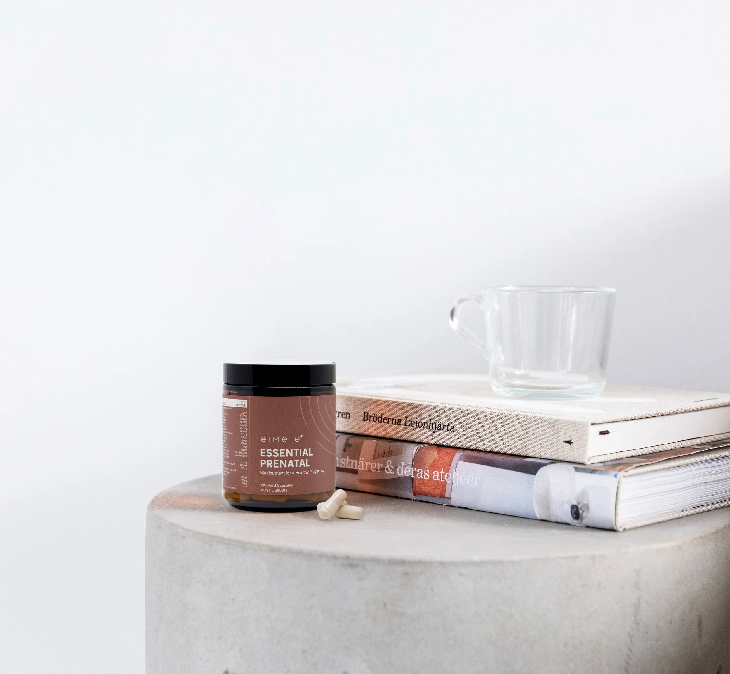
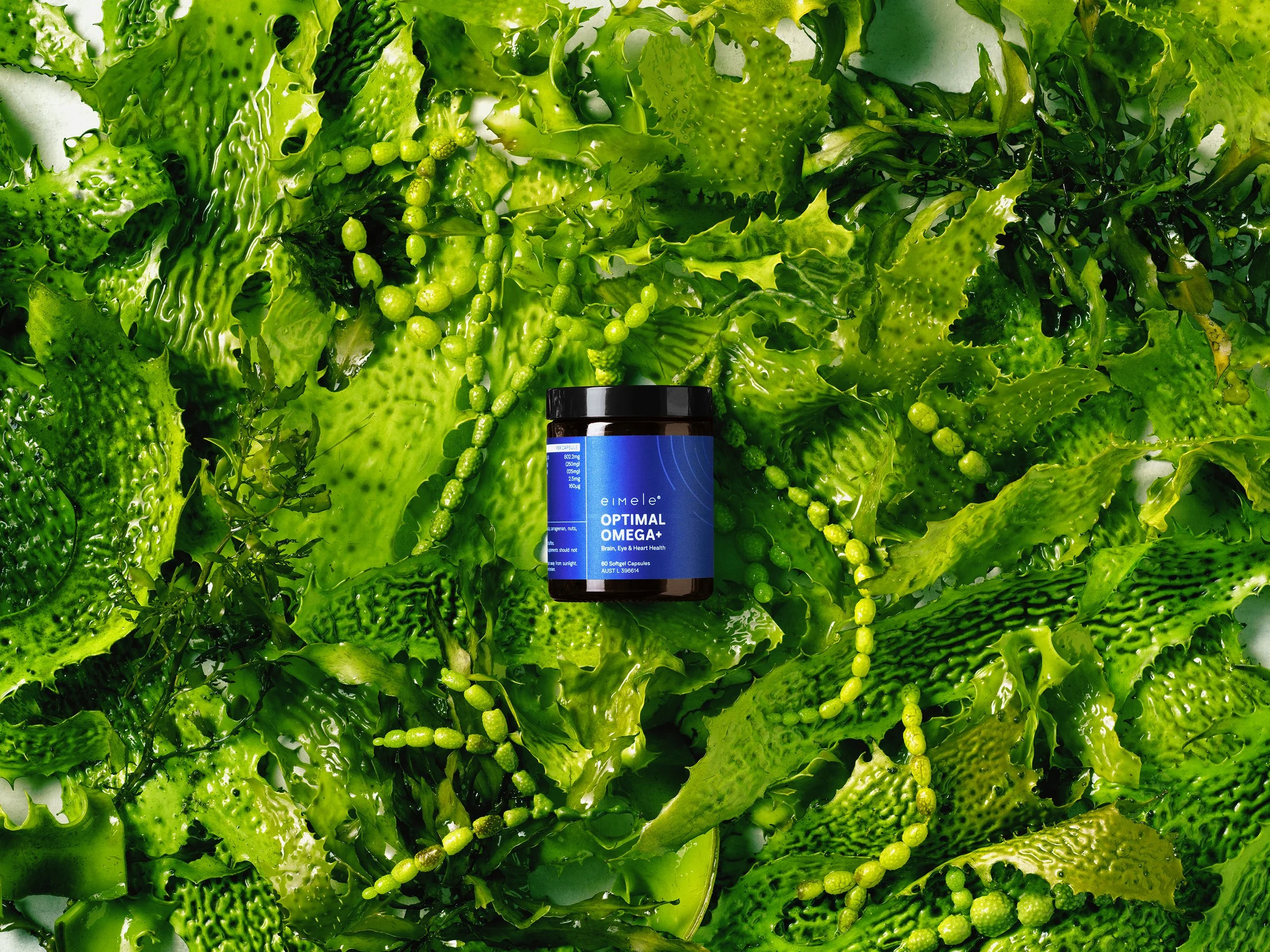
As the Australian wellness brand embarks on global expansion and development of new products, the eimele rebranding initiative ensures a cohesive customer experience by enhancing the brand's visual identity and streamlining packaging across its the new and existing product ranges. This elevated branding seamlessly translates into the revitalised eimele website and other social platforms assets, providing a cohesive experience for their audience.
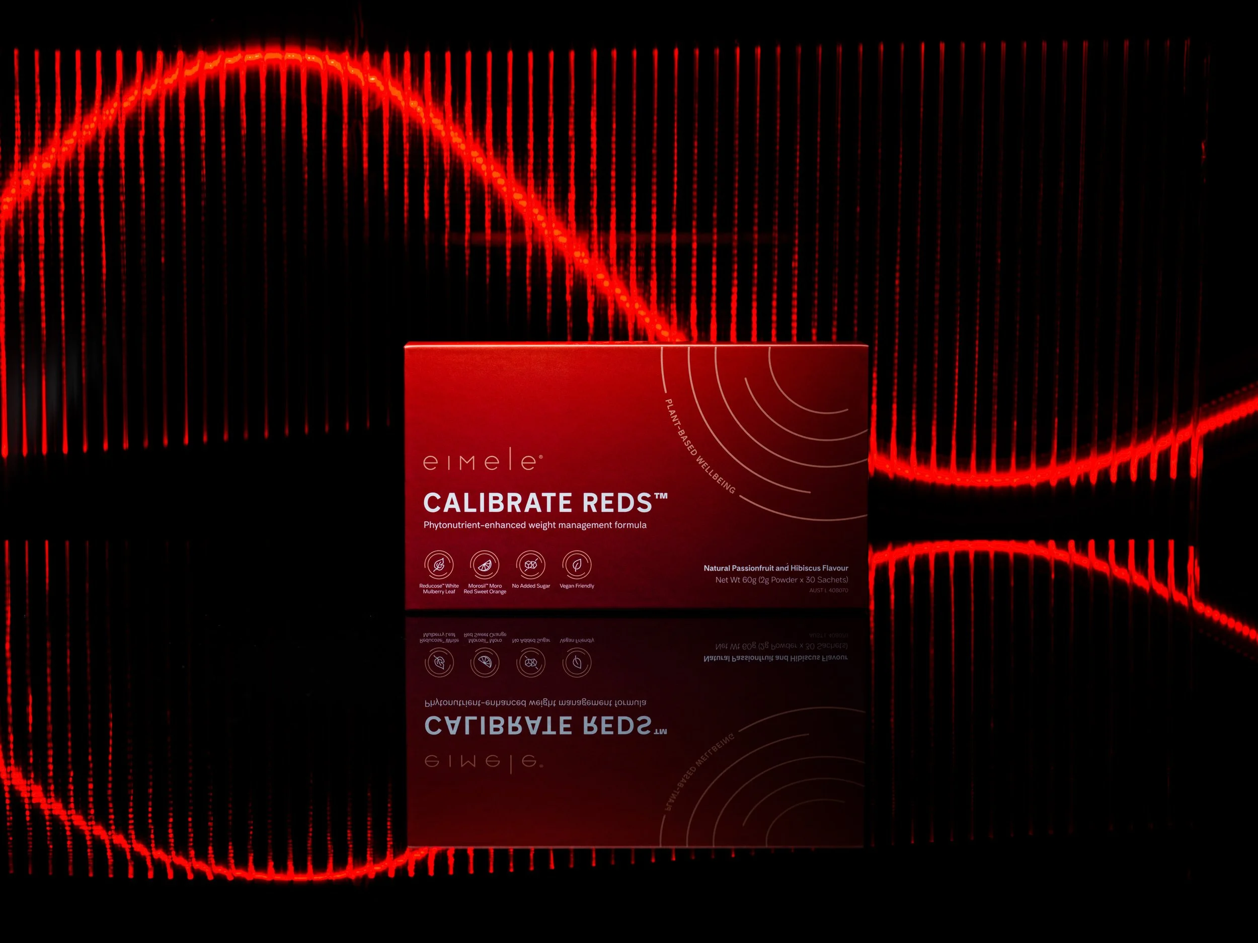
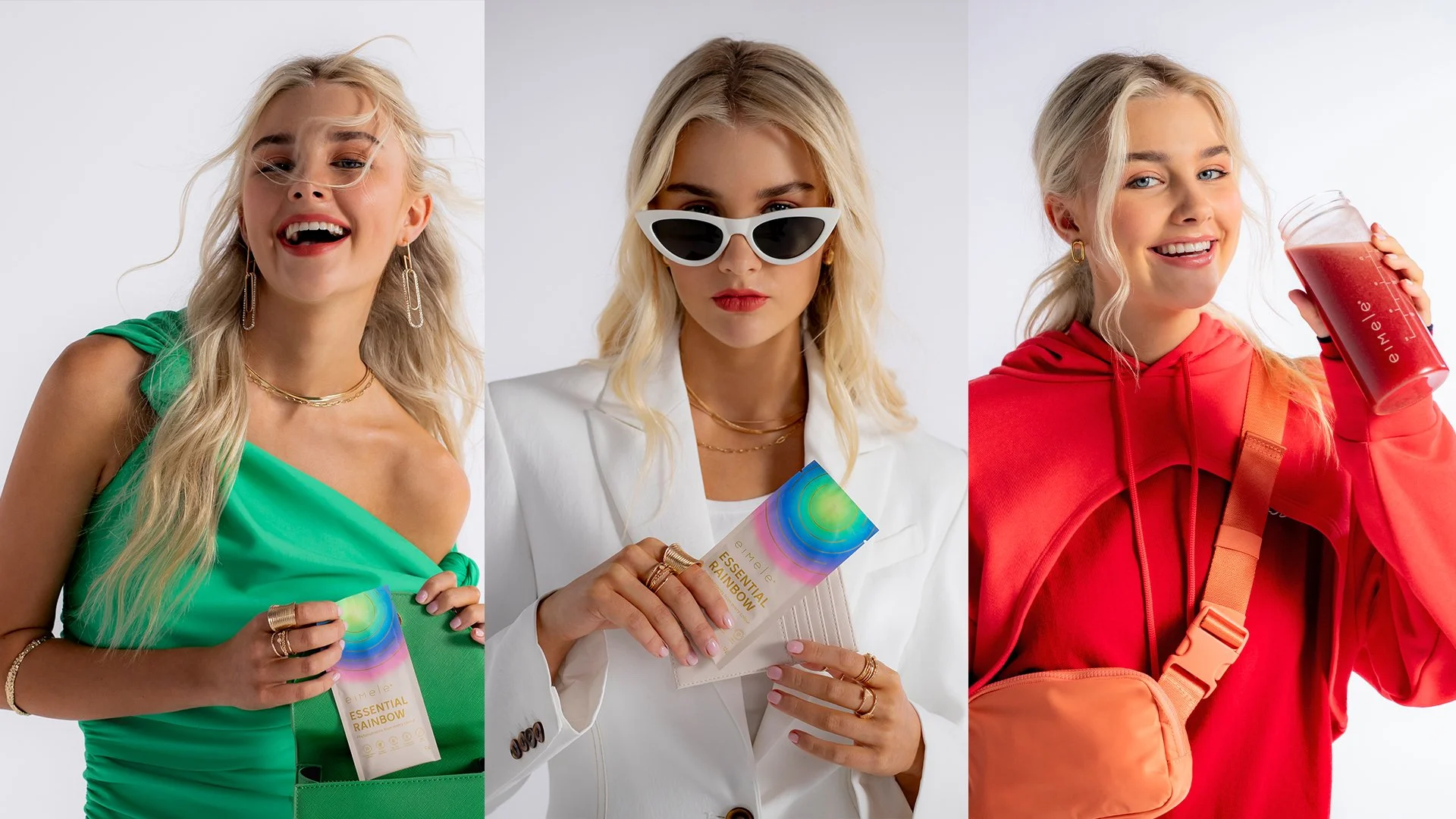
Key branding elements rolled out across various packaging formats and integrates into the website, visually tying the brand together.
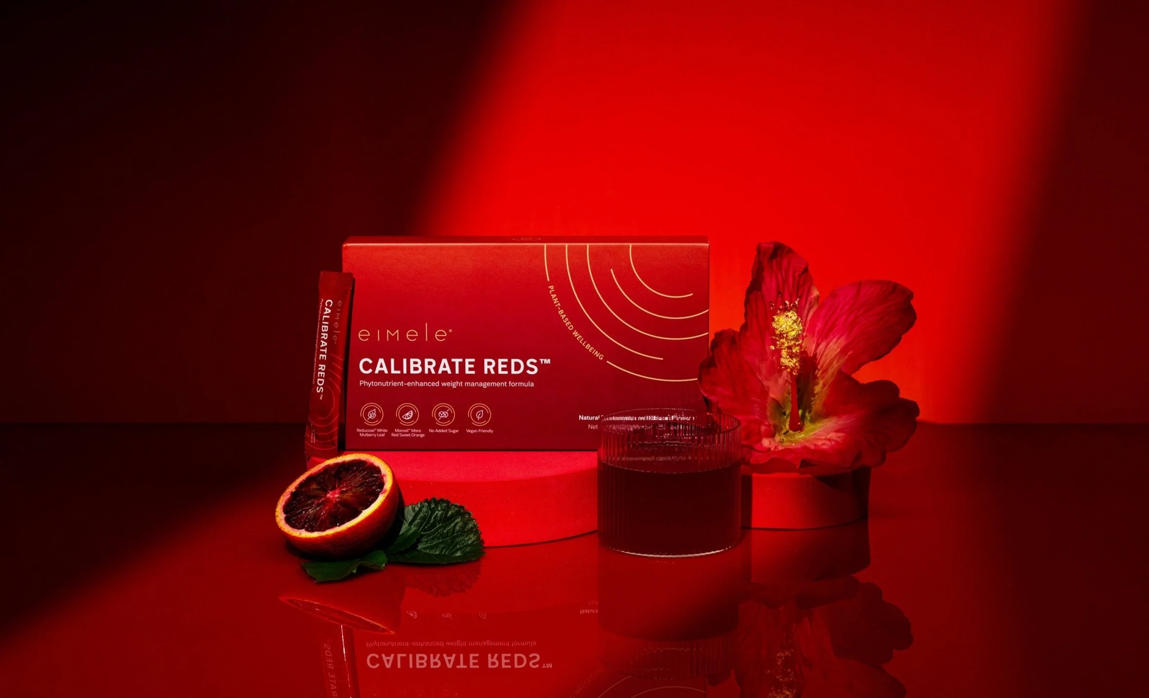
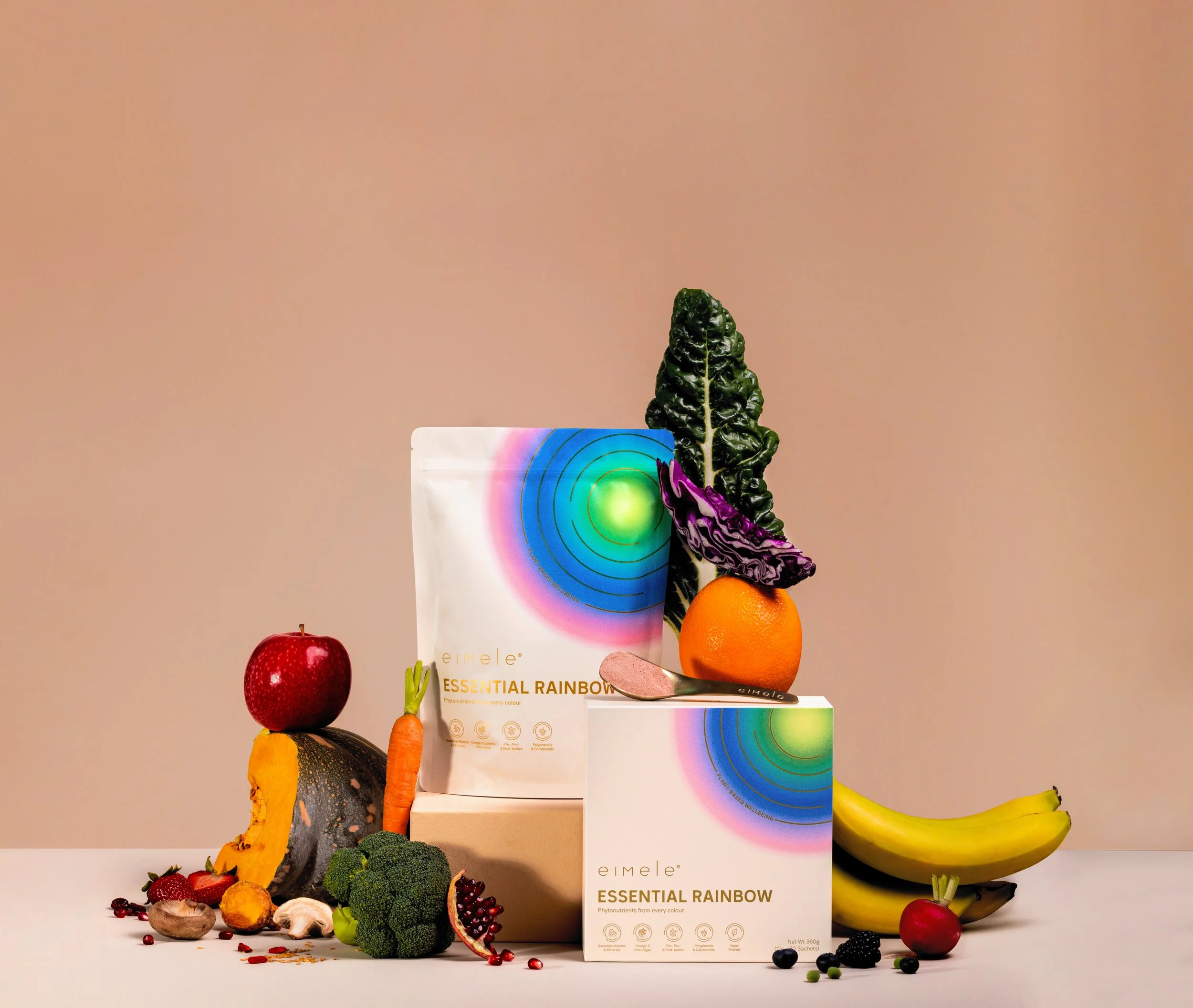
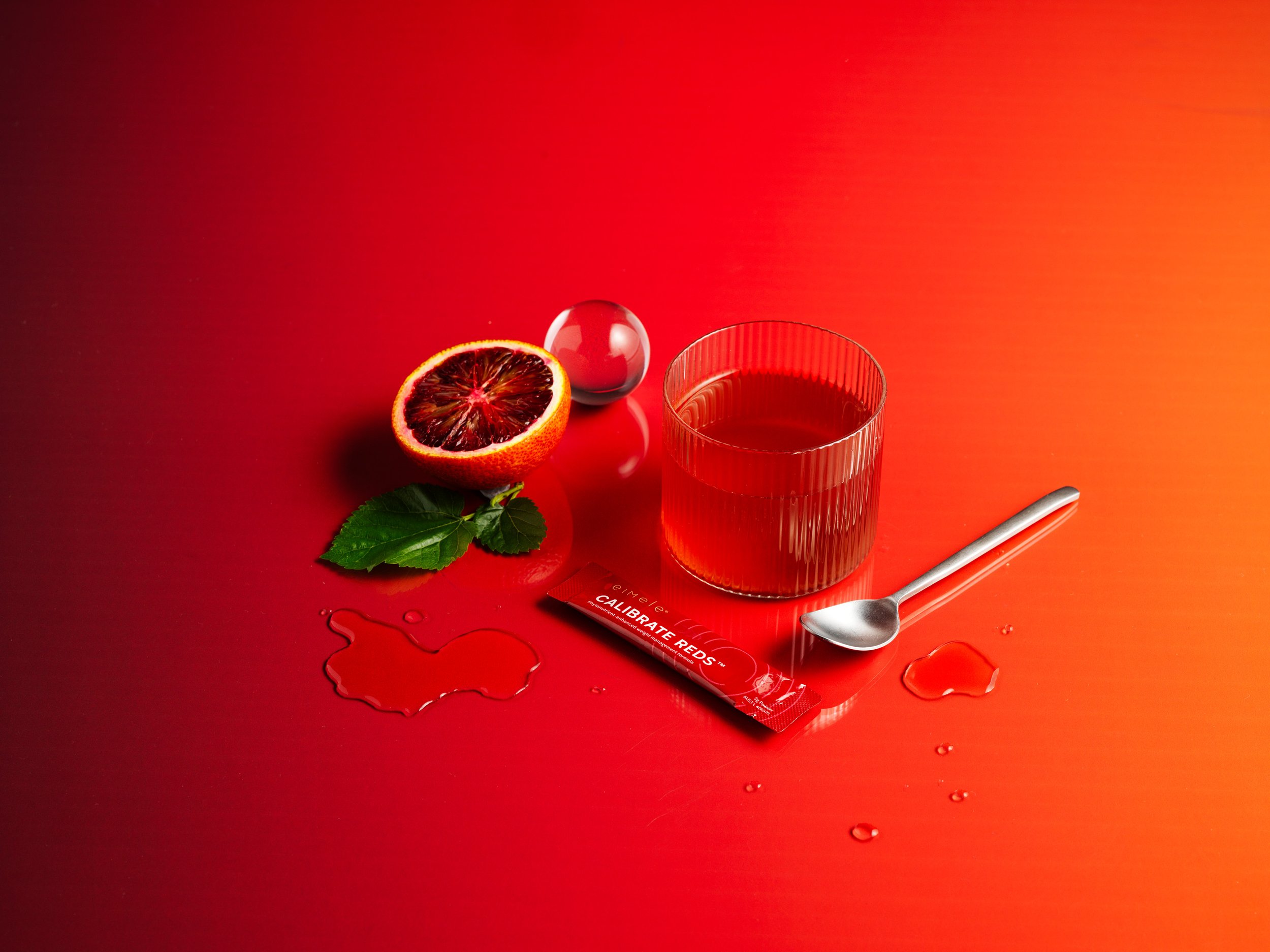
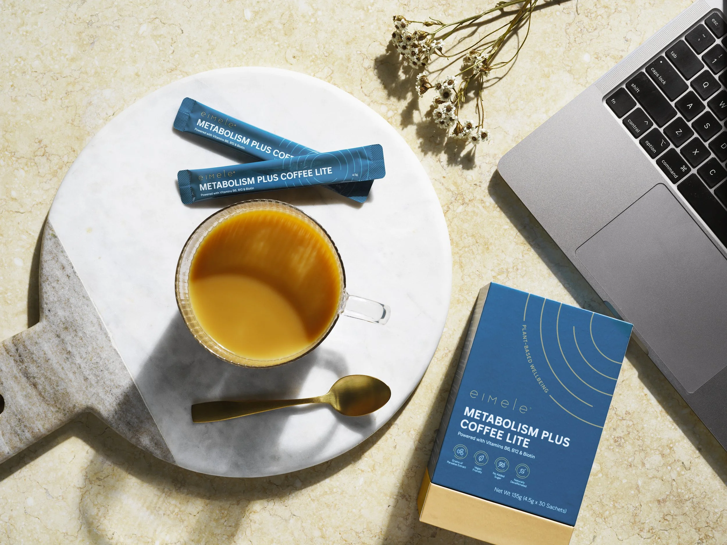
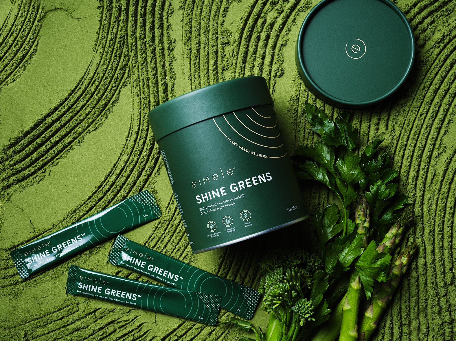
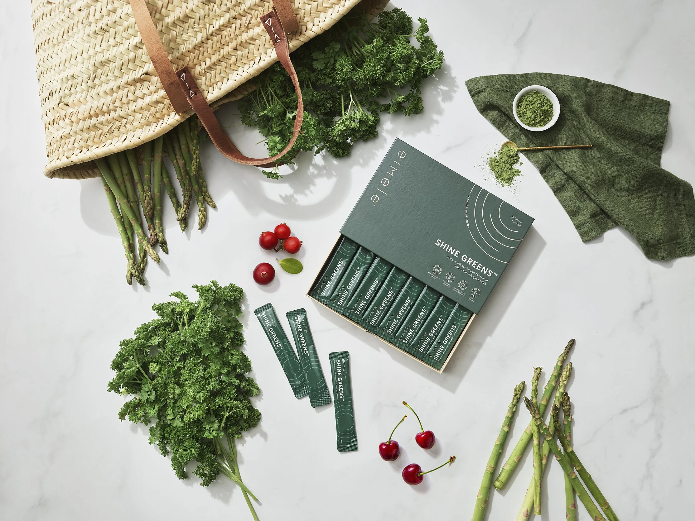
A straightforward visual hierarchy system, encompassing the eimele logo, product identifier, tagline, and bespoke custom icons highlighting hero ingredients and benefits, is implemented across the front of every secondary packaging face. Primary packaging is often a simplified variation of this visual hierarchy.
The signature eimele dial symbolises on-going wellbeing and is a representation of a target to a healthy lifestyle. Products are recognised by specific colours that echo its name and is reflective of its purpose. Both primary and secondary packaging uses the same dynamic colour balanced by a neutral beige.
Along with rollout of the new visual identity across packaging, a unified choice of material, finishing and structure plays a crucial role in enhancing the overall eimele customer experience.

Credit to:
Daphne S, Kylie M (Designers), Salt Studio (video), ACG x Edward, Ben and various others (Photography)