Xymbolic
A functional supplement brand created to improve and maintain all seven body systems.
Responsibilities:
Packaging concept and artwork, visual identity, packaging guideline
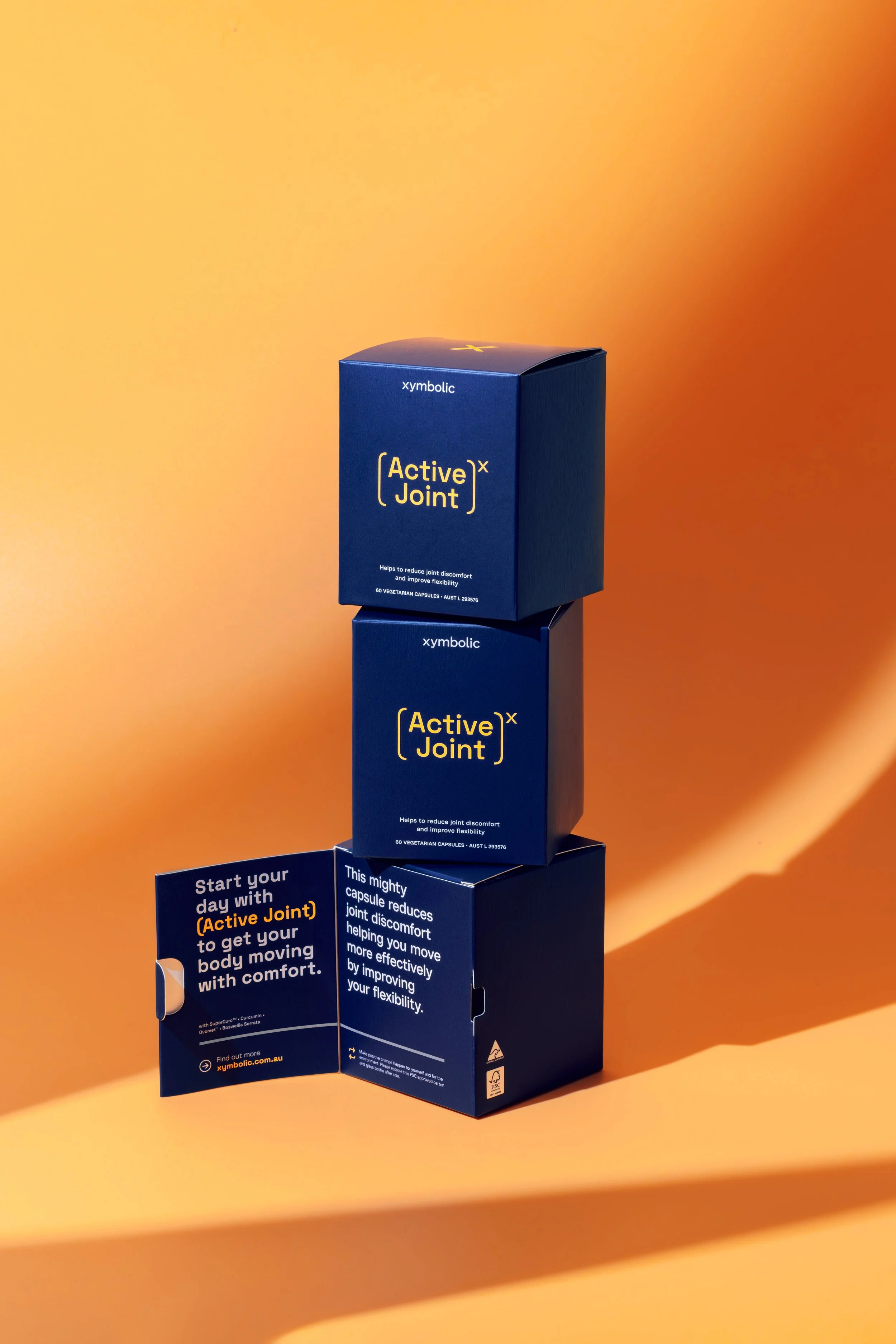
The Xymbolic branding reflects the brand’s cutting-edge formula that combines meticulously selected natural ingredients with advanced nutritional science to support the key functions of your body.
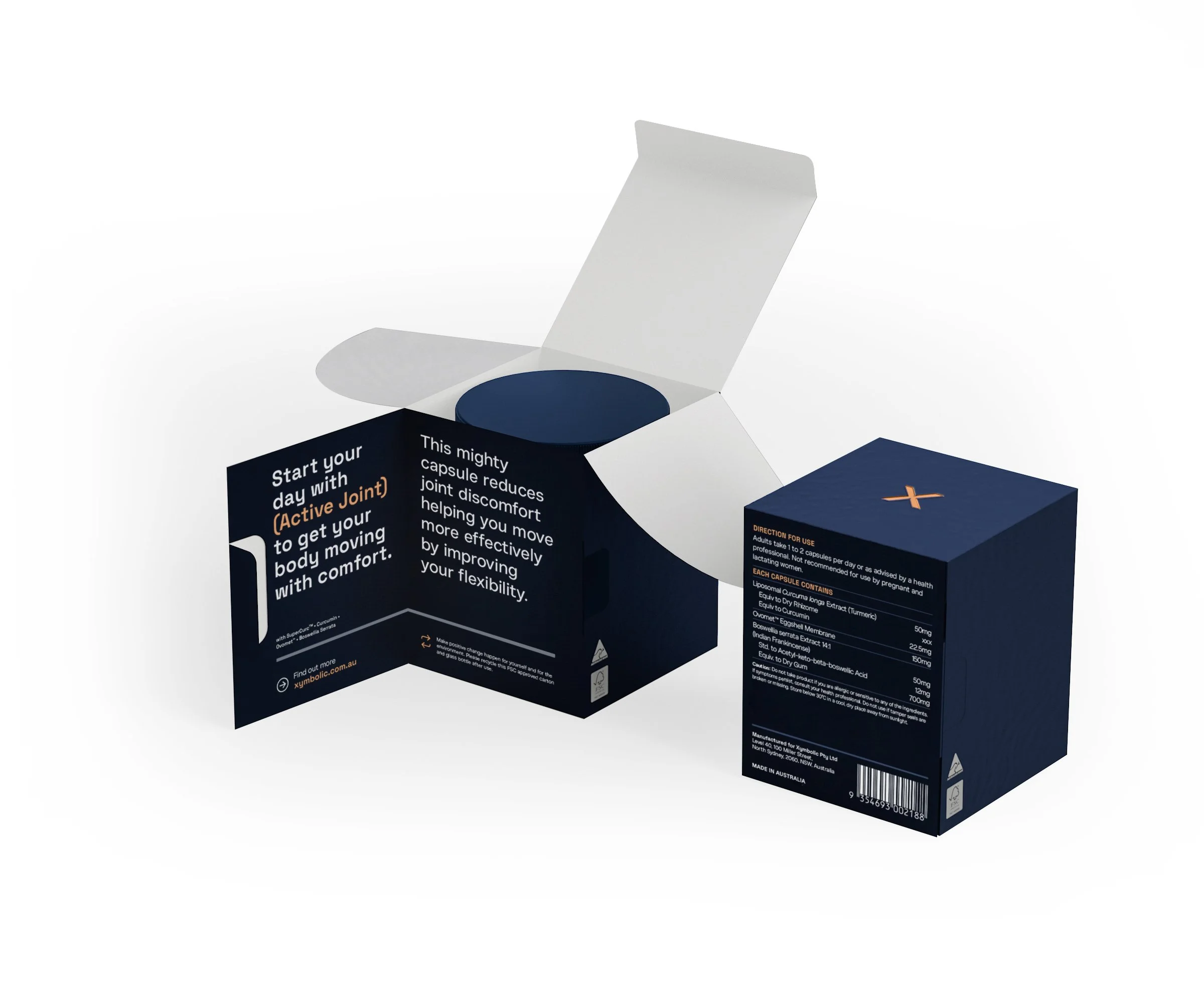
The logo mirrors the brand’s systematic approach, through the subtle edge and angular details that complement the soft curves of the letters. A monospace font is chosen for highlighting headings and stand-out statements, and paired with an easy-to-read, san-serif font for heavier text.
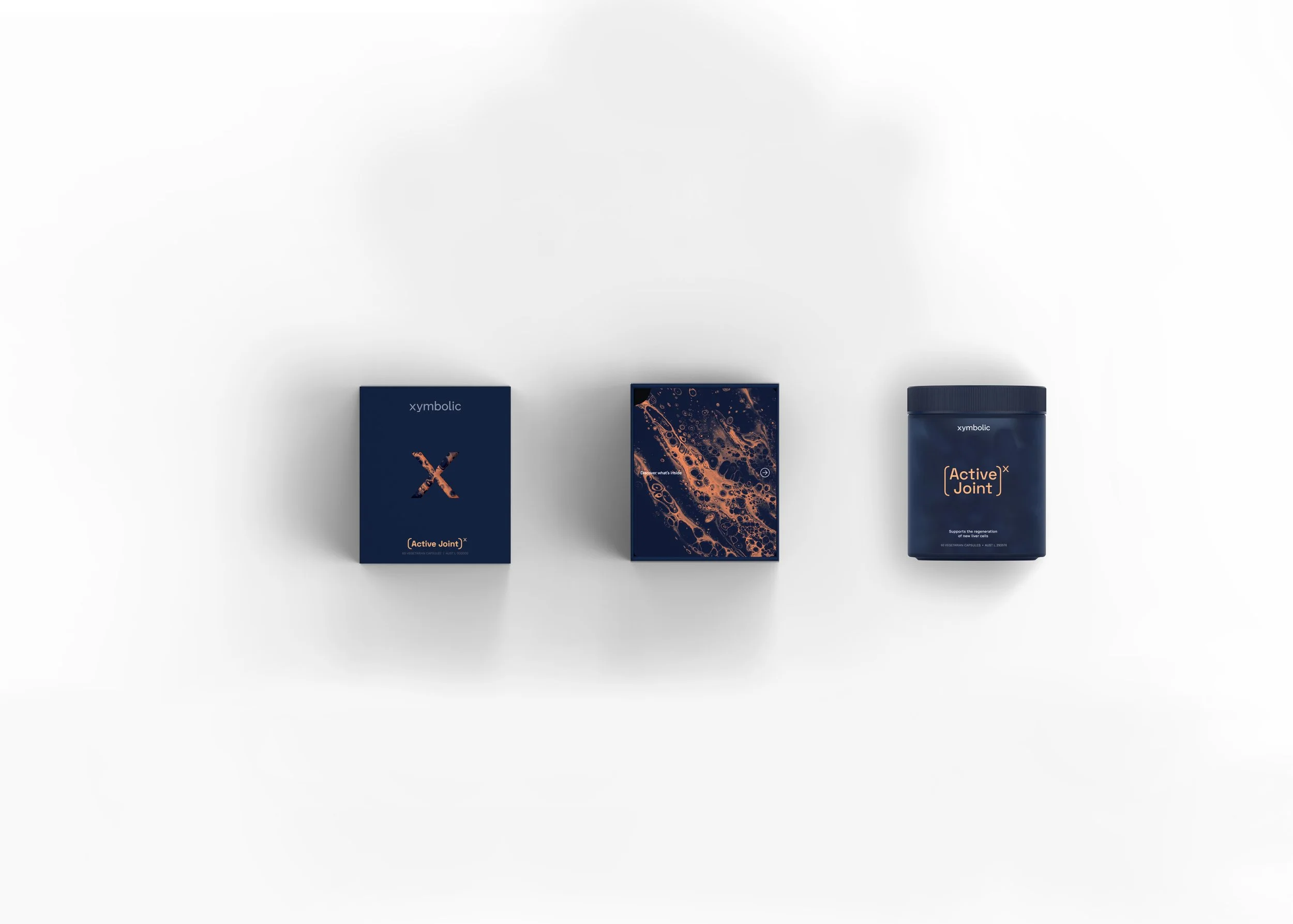
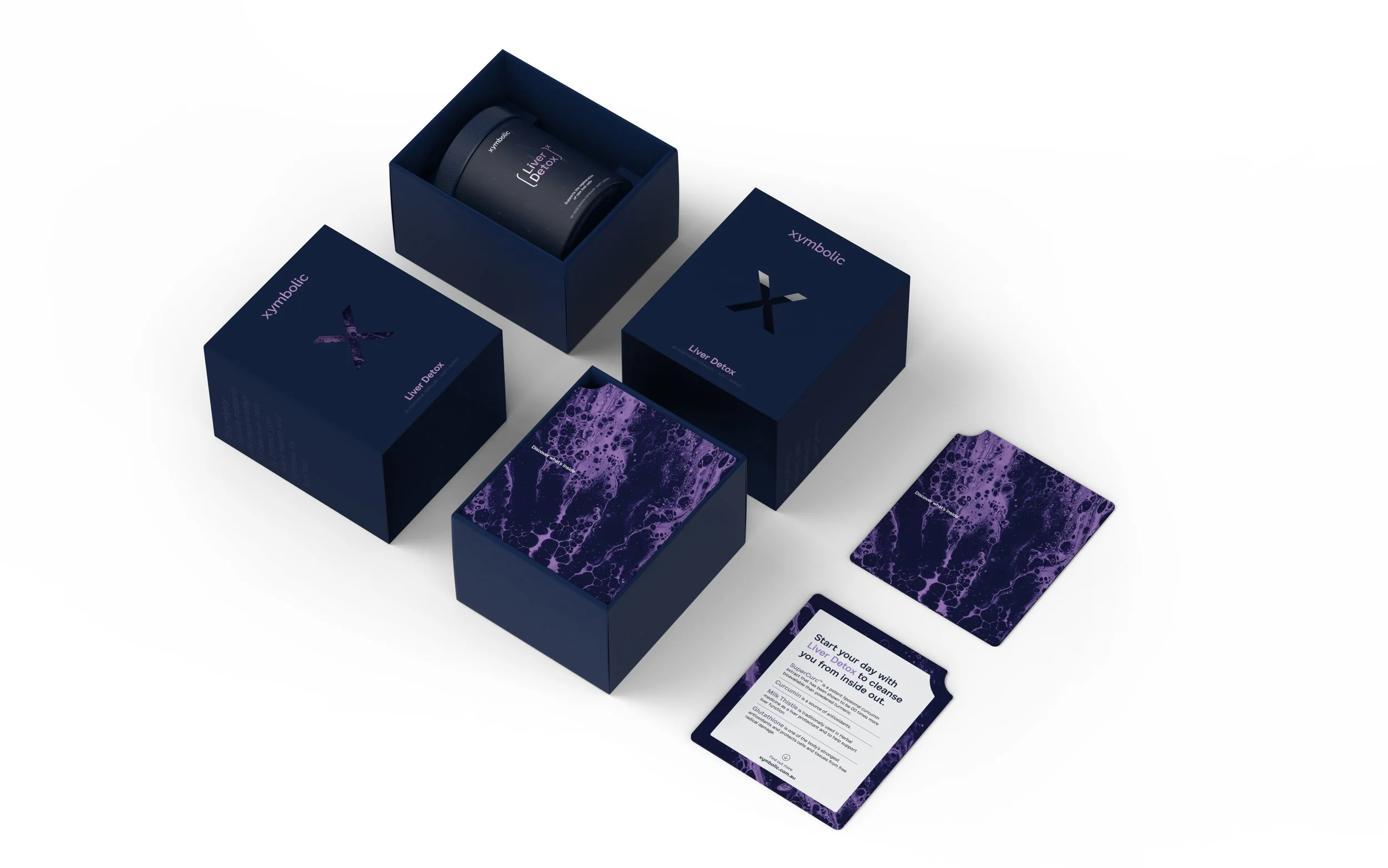
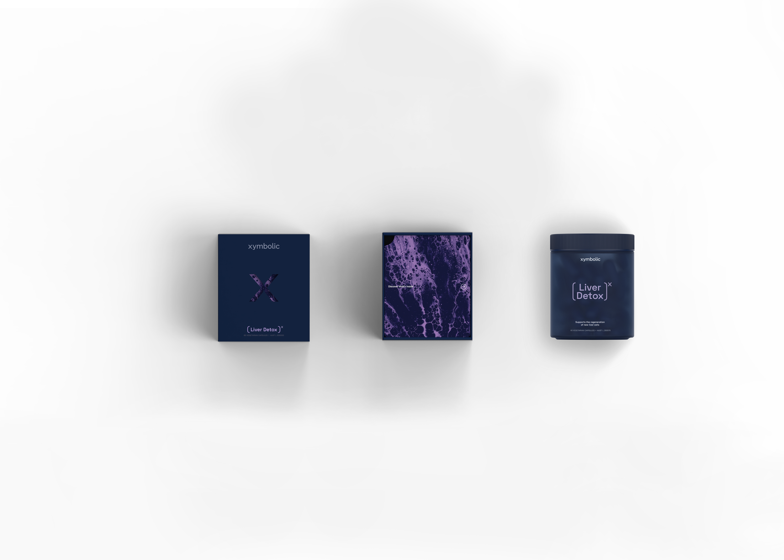
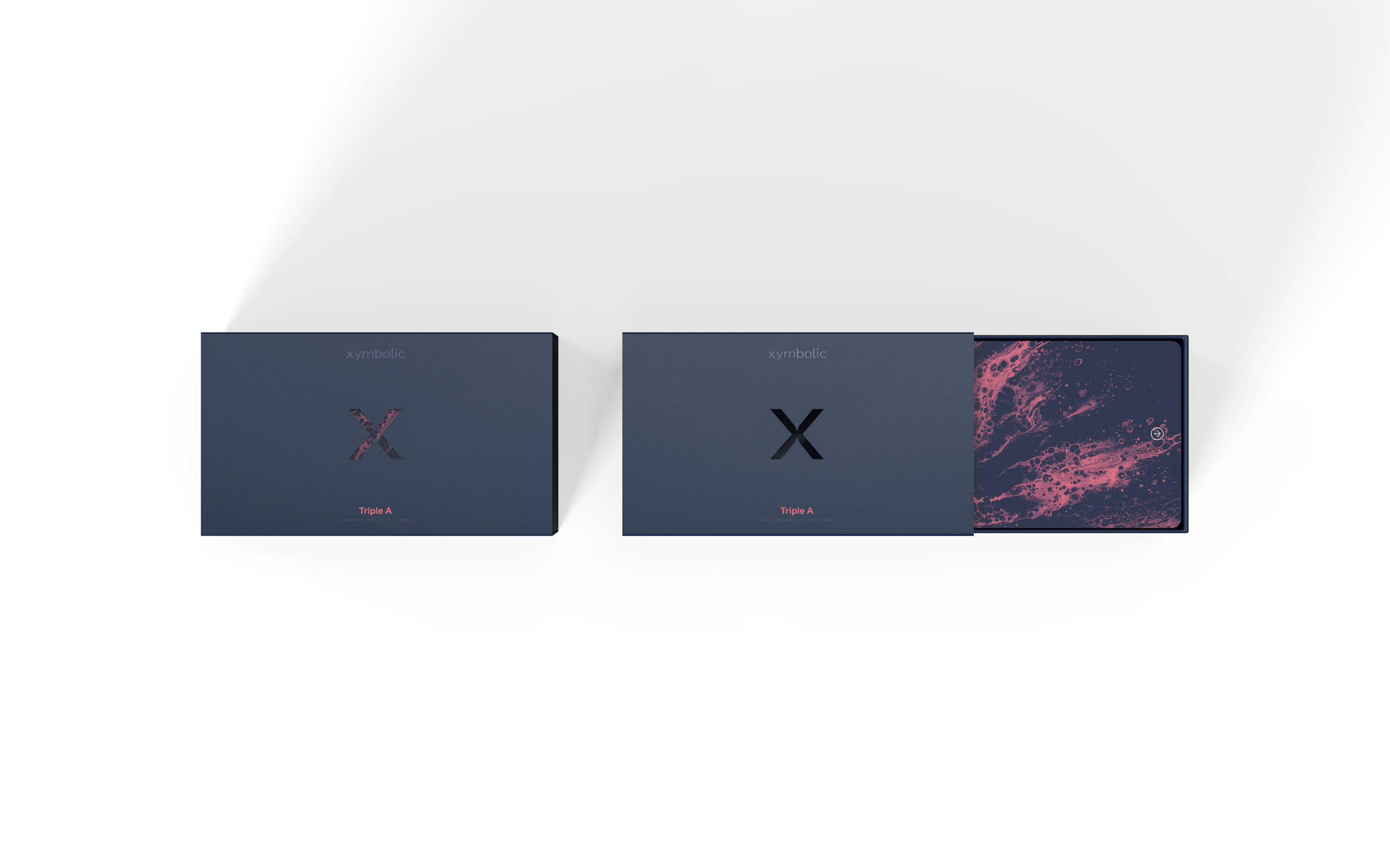
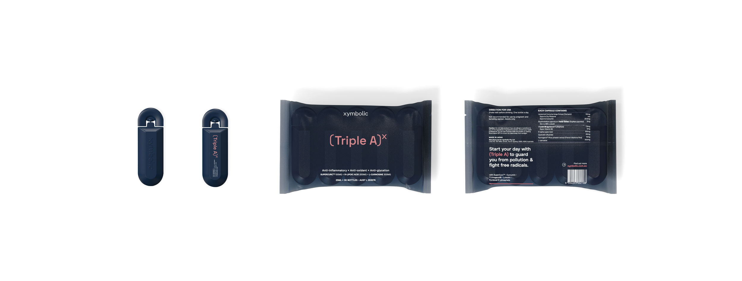
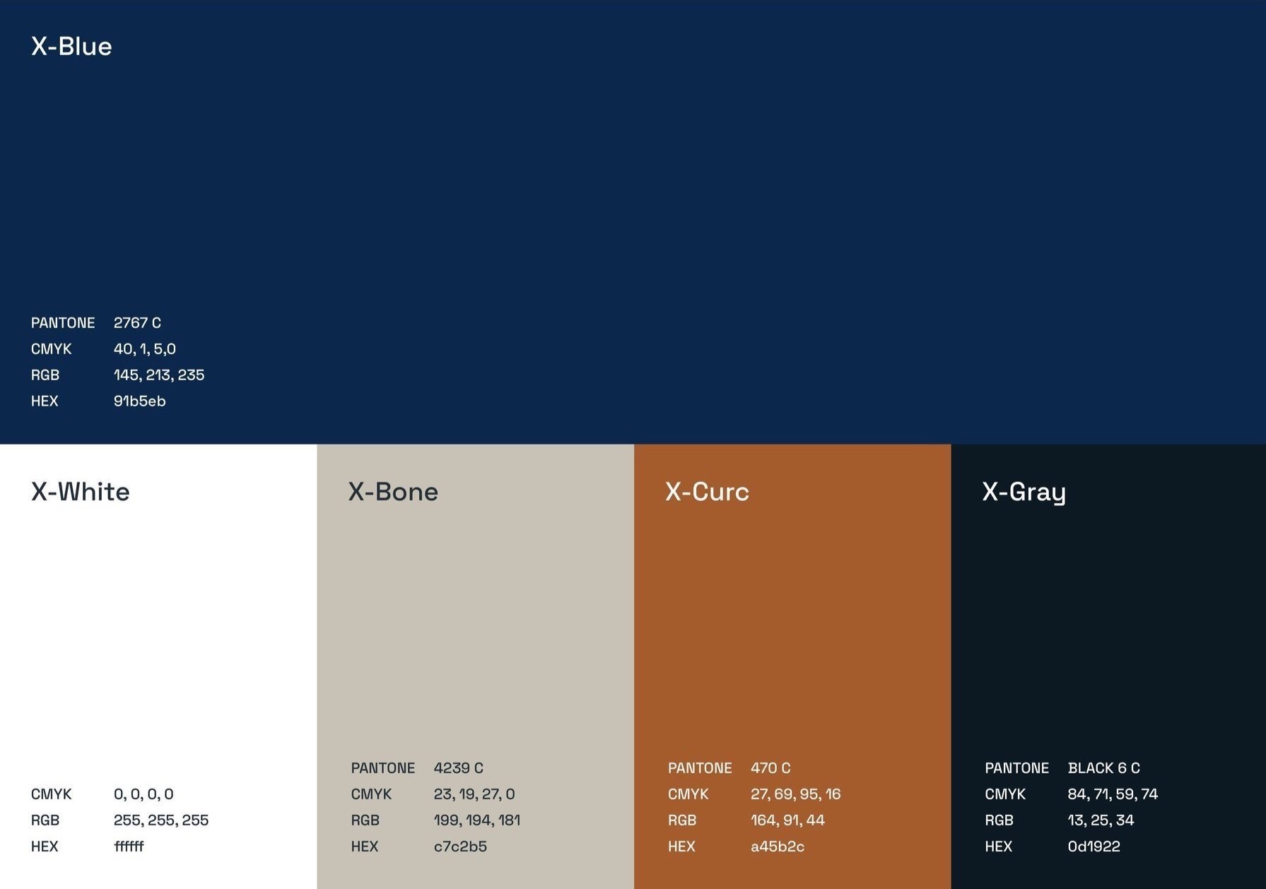
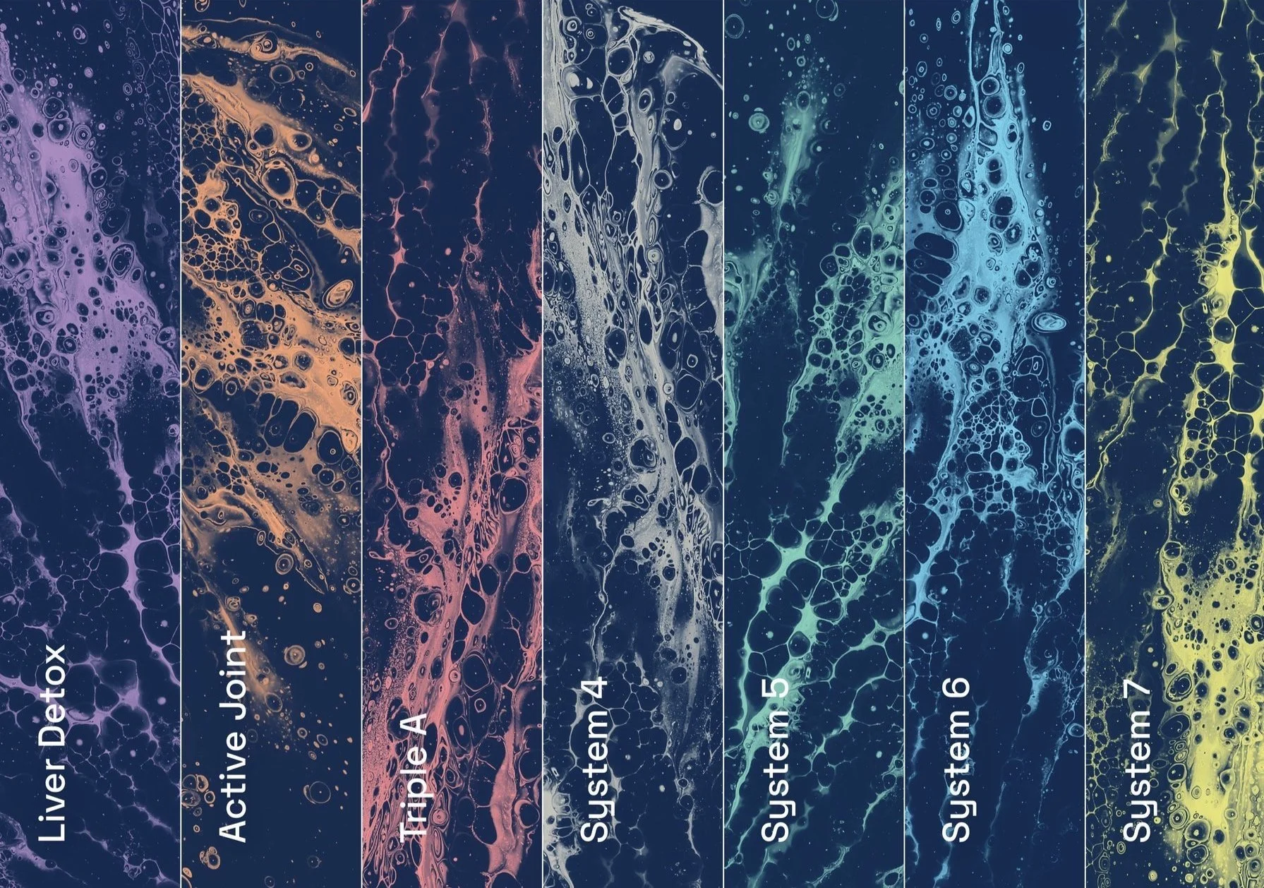
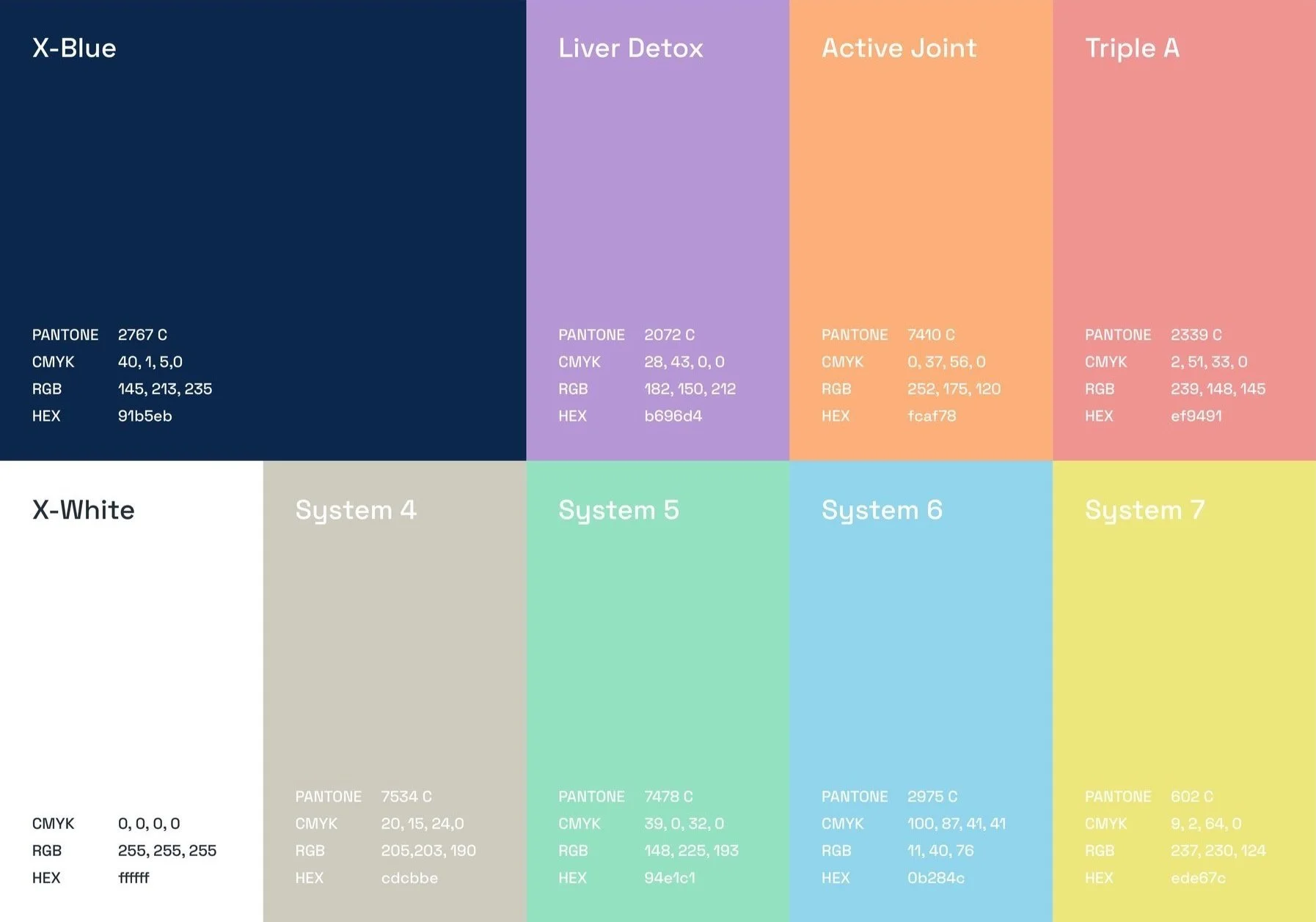
The bespoke ‘x’ icon is taken from the brand name, and is used as a stand-out graphic. The brand’s trusted deep navy core colour is contrasted with a sneak-peak of a bold duo-toned graphic through the ‘x’ cut-out on the secondary packaging. Each product is allocated a different colour symbolising the seven systems in the body.
To build trust through visual elements, mathematically inspired elements like soft-square brackets and using the ‘x’ to illustrate ‘to the power of’, emphasises the multiplication of efficacious benefits that Xymbolic offers.

Credit to:
Daphne S (Designer), Zackery X (3D Renderer)